


Why Prioritizing Mobile in Design is a Game Changer
In the digital age, designing for mobile devices first is no longer optional — it’s essential. Mobile traffic now accounts for over 63% of global internet use, illustrating why a mobile-first mindset benefits businesses aiming to capture and retain user attention. This approach ensures that the essential content and features are streamlined and accessible on the limited screen real estate of smartphones before expanding to desktops and larger devices.
Starting with mobile forces designers to focus on simplicity and usability, prioritizing the most important UI elements. This prevents bloated, cluttered interfaces that often plague desktop-first designs when scaled down. The result is a cleaner, faster, and more intuitive user experience that directly impacts engagement and conversion rates.
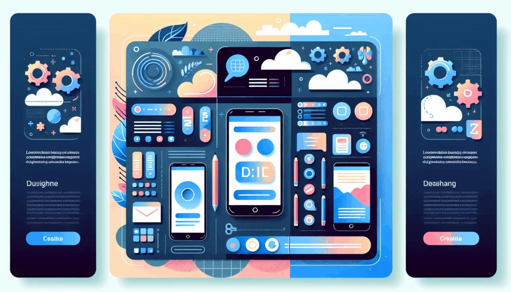
How Figma Empowers Mobile-First UI/UX Design
Figma has emerged as one of the top tools for UI/UX design, particularly strong for mobile-first projects. Its cloud-based platform promotes seamless collaboration across teams, allowing designers, developers, and stakeholders to work simultaneously on a project from anywhere.
Responsive Design Made Practical
Features like Auto Layout, Constraints, and responsive resizing allow designers to create flexible designs that adapt easily from small mobile screens to large desktop monitors. This means you can build a mobile interface first and efficiently scale or modify it for tablets and desktops without starting from scratch, saving time and reducing errors.
Figma’s design systems and components help create consistent UI elements that automatically update across the project, ensuring uniformity and speeding up iteration cycles. These capabilities are crucial for maintaining brand consistency across devices and platforms.
Collaboration and Handoff for Developers
With Figma’s real-time collaboration, teams can brainstorm using FigJam, a visual whiteboard tool integrated with Figma. Designers and product managers can discuss ideas live, approve changes, and iterate faster. Developers gain direct access to specs, CSS code, and assets directly from the design files, facilitating smoother handoffs and ensuring that the final implementation matches the design vision.
The Tangible Benefits of Mobile-First Design in Figma
- Enhanced User Experience: Designing for mobile first keeps the interface clean and focused on essential functions, improving usability and satisfaction.
- Improved Performance: Mobile-first designs tend to load faster and perform better on all devices, which is favored by Google’s search ranking algorithms.
- Greater Market Reach: With most users accessing websites and apps via mobile devices, prioritizing mobile helps capture a larger audience, boosting traffic and engagement.
- Simplified Development: Clear, focused mobile designs reduce complexity and help developers build scalable solutions efficiently.
- Competitive Advantage: Providing a seamless mobile experience can differentiate your brand in a crowded marketplace.
Real-World Success Stories Leveraging Figma and Mobile-First Design
Consider Kinsta, a managed WordPress hosting provider that emphasizes performance and user experience. By using mobile-first design principles and Figma’s collaborative platform, their design and development teams ensure the website is optimized for mobile users without sacrificing desktop functionality. This approach leads to faster load times, intuitive navigation, and ultimately higher customer satisfaction.
Similarly, digital agencies like Smashing Magazine showcase how mobile-first design paired with Figma streamlines the prototyping process, enabling designers to test and iterate rapidly based on user feedback. The ability to prototype interactive flows directly in Figma helps validate UI decisions before development starts, saving time and resources.
Tips to Master Mobile-First Design in Figma
- Start Simple: Focus on core functionality for the smallest screen and avoid unnecessary decoration or complexity.
- Use Auto Layout: Leverage Figma’s Auto Layout to create flexible, adaptive designs that respond to different screen sizes.
- Apply Constraints: Set constraints on elements to control how they resize or reposition based on the frame size.
- Build Reusable Components: Design buttons, menus, and other UI elements as components to maintain consistency and speed up updates.
- Collaborate Constantly: Use Figma’s live collaboration and FigJam sessions to align your team and gather timely input.
- Test Prototypes on Real Devices: Utilize Figma’s mobile app or browser previews to experience the design on actual phones and tablets.
Integrate Mobile-First Design into Your Workflow with Belov Digital
At Belov Digital Agency, we specialize in creating responsive, mobile-first websites and applications that look stunning and perform flawlessly. Our expert designers use Figma extensively to build efficient, user-centered designs that adapt to any device.
If your project demands cutting-edge UI/UX combined with best-in-class technical execution, contact us to learn how we can elevate your brand’s digital presence.
Conclusion: The Future is Mobile-First, and Figma is Leading the Way
The mobile-first design philosophy is more relevant than ever as users increasingly prefer mobile devices for browsing and interaction. Figma’s powerful toolset empowers designers to create intuitive, scalable, and visually compelling interfaces with ease, collaboration, and precision.
By embracing mobile-first design using Figma, businesses can deliver superior user experiences, improve SEO and performance, and ultimately drive more engagement and conversions. It’s an investment that pays dividends in today’s competitive digital landscape.
Explore more about mobile-first UI/UX strategies and how they can transform your projects by visiting Codica’s comprehensive guide or diving into BrowserStack’s implementation tips. For hands-on tutorials, the YouTube video on mobile first design in Figma offers practical insights.