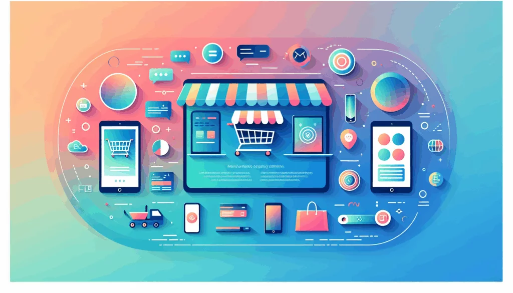


Creating a compelling and user-friendly website is a complex task that involves numerous design elements, each playing a crucial role in enhancing the overall user experience. Among these elements, visual hierarchy stands out as a fundamental principle that guides users through the content, ensuring they focus on the most important information first. In this article, we will delve into the importance of visual hierarchy in web design, explore its key principles, and discuss how it can be effectively implemented to boost user engagement and conversion rates.
Crafting a Seamless User Experience
Visual hierarchy is essentially about organizing design elements in a way that directs users’ attention to the most critical parts of a webpage. This is achieved by manipulating various visual characteristics such as size, color, contrast, alignment, and proximity. By doing so, designers can create a clear roadmap for users, making it easier for them to navigate through complex information without feeling overwhelmed.
For instance, when designing a website for a business, using larger font sizes for headings and smaller sizes for body text helps establish a clear hierarchy. Similarly, employing bright colors for call-to-action buttons and muted colors for background elements can guide users toward desired actions. This strategic use of visual hierarchy not only enhances readability but also improves the overall aesthetic appeal of the website.
Key Principles of Visual Hierarchy
Understanding the core principles of visual hierarchy is crucial for effective web design. Here are some of the key elements to consider:
- Size: Larger elements naturally draw more attention. For example, using a larger font size for headings compared to body text helps users quickly identify the most important information.
- Color: Bright colors typically attract more attention than muted ones. For instance, using red for call-to-action buttons can make them stand out.
- Contrast: Dramatically contrasted colors are more eye-catching. This can be achieved by using a bright color against a neutral background.
- Alignment: Proper alignment creates order and helps in structured content presentation. Misaligned elements can stand out, but they should be used sparingly to avoid visual chaos.
- Proximity: Closely placed elements seem related. Grouping similar content together can improve user understanding and navigation.
- Whitespace: More space around elements draws the eye towards them. Adequate use of whitespace can prevent clutter and enhance focus on key elements.
Implementing Visual Hierarchy in Web Design
To effectively implement visual hierarchy in web design, consider the following strategies:
- Define Your Goals: Start by identifying the primary objectives of your website. Whether it’s to drive sales, generate leads, or provide information, your design should align with these goals. For example, an eCommerce site should prioritize product visuals and call-to-action buttons.
- Use Visual Patterns: Patterns like the F Pattern and Z Pattern are widely used in web design to guide user attention. The F Pattern is ideal for text-heavy content, while the Z Pattern suits minimal designs like landing pages.
- Consistency is Key: Ensure consistency in elements like color schemes, fonts, and button styles. This lends your website a professional look and enhances user experience. For instance, using a consistent color scheme across all pages helps maintain brand identity.
- Test and Refine: Once your design is in place, test it with target users to ensure that the visual hierarchy effectively guides their attention. Refine your design based on feedback to optimize user engagement.
Real-World Examples
Let’s look at some real-world examples of effective visual hierarchy in action:
- Apple’s Website: Apple is renowned for its minimalist yet powerful design. The company uses size and color contrast to draw attention to key features and products. For instance, the latest iPhone model is prominently displayed with larger images and bold typography, while less important information is presented in smaller text.
- Kinsta’s Website: Kinsta, a leading managed WordPress hosting provider, uses a clear visual hierarchy to guide users through their services. They emphasize key features like speed and security with larger font sizes and vibrant colors, making it easy for visitors to understand their offerings.
Tools and Resources for Visual Hierarchy
To create effective visual hierarchies, designers can leverage various tools and resources:
- Adobe XD: A powerful tool for designing and prototyping user interfaces. It offers features like color and typography management that can help establish a consistent visual hierarchy.
- Figma: A collaborative design platform that allows real-time feedback and iteration. It’s ideal for refining visual hierarchies based on user testing.
- Canva: A user-friendly graphic design platform that provides pre-made templates and design elements. It’s great for non-designers who want to create visually appealing content with a clear hierarchy.
Enhancing User Experience with Visual Hierarchy
Visual hierarchy is not just about aesthetics; it plays a crucial role in enhancing user experience. By guiding users through the content in a logical and intuitive manner, visual hierarchy reduces cognitive load and increases engagement. This, in turn, can lead to higher conversion rates and improved brand loyalty.
For instance, a well-designed eCommerce site with a clear visual hierarchy can lead customers directly to the checkout process, reducing friction and increasing sales. Similarly, an informational website with a logical hierarchy can help users quickly find relevant resources, improving their overall satisfaction.
Conclusion and Next Steps
In conclusion, visual hierarchy is a vital component of effective web design. By understanding and applying its principles, designers can create websites that are not only visually appealing but also user-friendly and engaging. Whether you’re building a new website or refining an existing one, incorporating a clear visual hierarchy can significantly enhance user experience and drive business success.
If you’re looking to improve your website’s visual hierarchy or need assistance with web design, feel free to contact us at Belov Digital Agency for expert guidance and support. We specialize in crafting websites that are both visually stunning and optimized for user engagement.
To further explore the world of web design and user experience, check out our other resources and articles on Belov Digital’s blog, where you can find insights on the latest trends and best practices in digital design. Additionally, for more information on visual design principles, visit the Nielsen Norman Group or the Interaction Design Foundation for comprehensive guides and courses.