


When it comes to crafting a memorable website, every element plays a crucial role, but few are as impactful as typography pairing. Effective typography pairing can elevate your web design aesthetics, enhance readability, and create a visual hierarchy that guides visitors through your site. At Belov Digital Agency, we understand the significance of typography in web design and how it contributes to a site’s overall user experience.
Understanding Typography Pairing
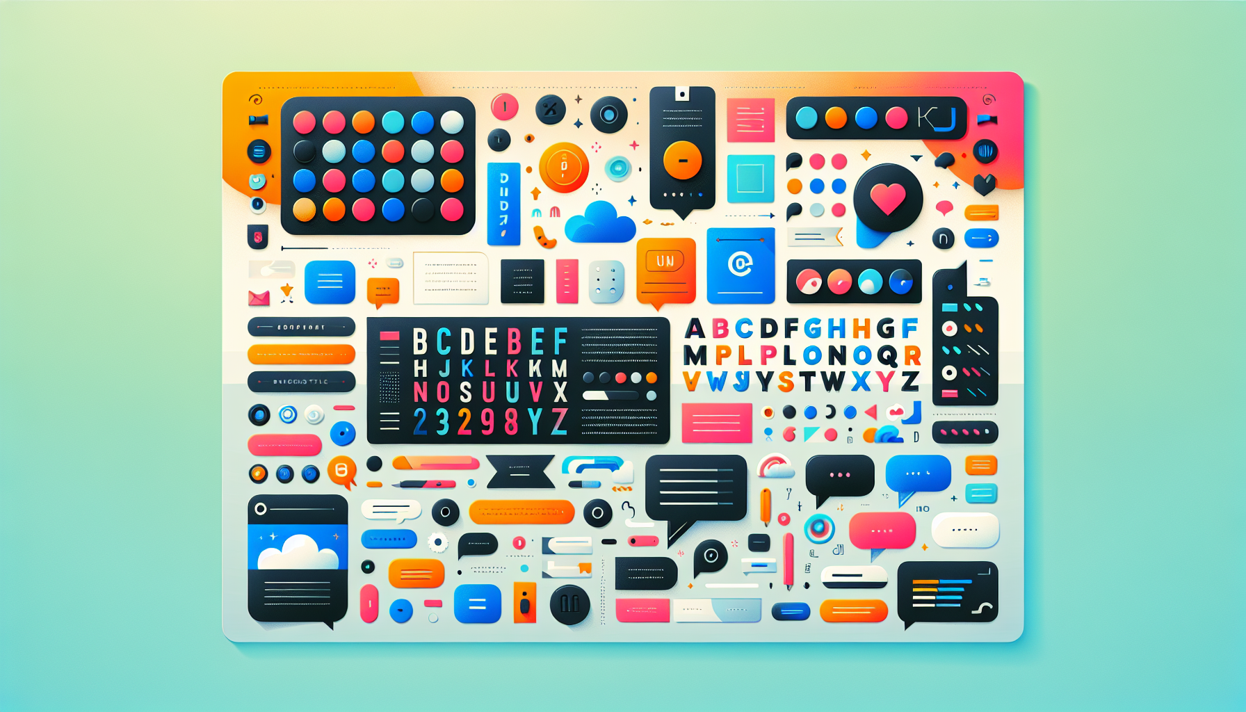
Typography pairing refers to the practice of combining two or more different fonts within a design to create visual harmony and contrast. This technique is essential for establishing a clear hierarchy on your website, ensuring that visitors can easily distinguish between headers, body text, and other key elements.
Importance of Contrast
One of the most important principles in typography pairing is contrast. Contrast helps create visual interest and guides the viewer’s eye through the content. For instance, pairing a bold sans-serif font like Montserrat with a more elegant serif font like Playfair Display can produce a stunning visual effect, as demonstrated in Looka’s font pairing examples.
Role of Visual Hierarchy
Visual hierarchy is another key concept in typography pairing. By using different font sizes, styles, and weights, you can direct the viewer’s attention to specific parts of your website. This not only improves readability but also enhances the overall aesthetic appeal of your site. Canva offers excellent guidance on creating effective visual hierarchies using typography.
Best Practices for Typography Pairing
Here are some best practices to consider when pairing fonts for your website:
- Limit the Number of Fonts: Avoid using more than three fonts on your website. Too many fonts can create visual noise and detract from the user experience. According to PaperStreet, using two complementary fonts is often the best approach.
- Choose Fonts That Complement Each Other: Pair fonts that have contrasting styles, such as serif and sans-serif, to create visual interest. However, ensure they are legible and work well together. The Futur highlights the importance of selecting fonts that flow well together.
- Consider Your Brand Identity: Your font choices should align with your brand’s tone and style. For example, a tech startup might opt for modern sans-serif fonts like Gotham paired with Open Sans, as featured in Looka’s examples.
Examples of Effective Typography Pairing
1. Montserrat and Playfair Display
This pairing is ideal for websites that need a balance of elegance and modernity. Montserrat provides a clean and contemporary feel, while Playfair Display adds a touch of sophistication.
2. Gotham and Open Sans
Gotham’s geometric lines paired with Open Sans’s humanist feel make this combination perfect for tech and healthcare websites, where clarity and innovation are key.
3. League Spartan and Libre Baskerville
League Spartan’s bold, condensed style offers a striking contrast to Libre Baskerville’s classic elegance, making this pair great for modern architecture or design-focused sites.
Tools and Resources for Typography Pairing
When it comes to selecting and implementing font pairings, you don’t have to do it alone. Here are some tools and resources that can help:
- Google Fonts: Offers a wide range of free fonts that can be easily integrated into your website. Google Fonts provides numerous pairing suggestions, as discussed on The Futur.
- Canva: Provides an intuitive platform for designing and experimenting with different font combinations. Canva’s guides and tutorials are invaluable for learning best practices in typography.
How to Implement Typography Pairing on Your Website
Implementing effective typography pairing on your website involves several steps:
- Select Your Fonts: Choose fonts that complement your brand’s tone and style. Ensure they are legible in various sizes and on different devices.
- Use a Content Management System (CMS): Platforms like WordPress allow you to easily change fonts across your site using plugins like Elementor or WPBakery.
- Adjust Font Sizes and Styles: Use CSS or your CMS’s built-in options to adjust font sizes, weights, and styles to create a clear visual hierarchy.
- Test and Iterate: Test your font pairings on different devices and browsers to ensure they look great everywhere. Be ready to make adjustments based on user feedback and design evolution.
Hosting Solutions for Typography-Optimized Websites
Once you’ve crafted a typography-rich website, it’s essential to ensure it loads quickly and is accessible to all users. For hosting, consider Kinsta, which offers lightning-fast performance and reliable uptime, ensuring your site looks and performs its best.
Conclusion: Elevating Your Brand with Typography Pairing
Typography pairing is more than a simple design choice; it’s a powerful tool for creating memorable websites that engage and retain visitors. By understanding the principles of contrast, visual hierarchy, and brand identity alignment, you can craft a website that showcases your brand’s personality and excellence. If you’re looking to elevate your web design aesthetics, reach out to us at Belov Digital Agency for expert guidance and support.
For those interested in learning more about web design and typography, we invite you to explore our blog, where you’ll find insights and resources on crafting stunning digital experiences. Whether you’re a seasoned designer or just starting your web design journey, effective typography pairing can be the key to unlocking your website’s full potential.