Have you ever visited the Chinese Behance?
Honestly, it’s quite different from European sites with its unique atmosphere and style.
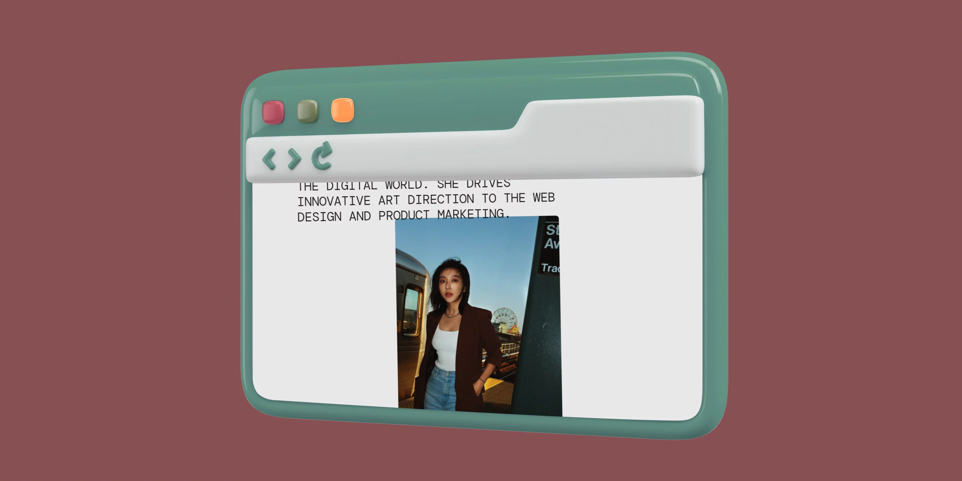
Today, in the “Site of the Day” roundup, I came across the work of a designer of Chinese origin. And it really stands out for its visual identity.
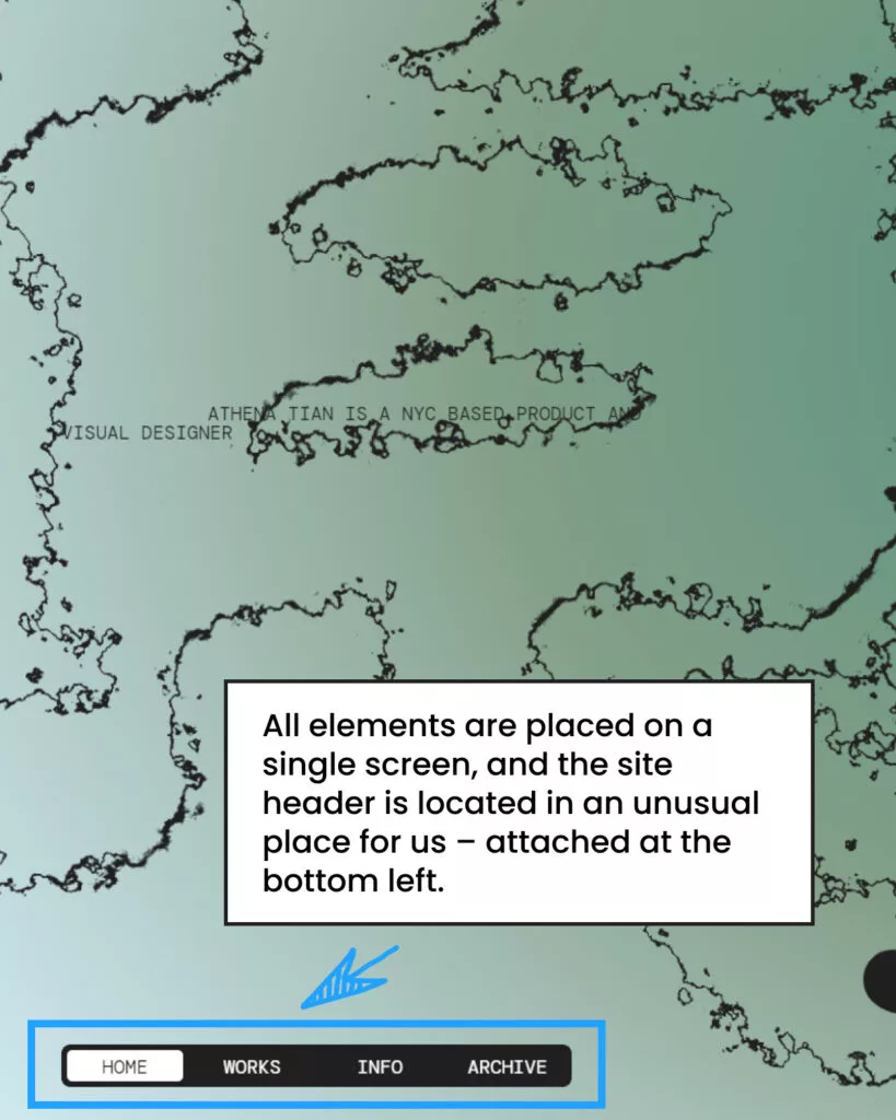
All elements are placed on a single screen, and the site header is located in an unusual place for us – attached at the bottom left. After Awwwards also placed their header at the bottom, I’ve started noticing this trend more frequently. It might actually be a good solution to free up more space for creative content presentation.
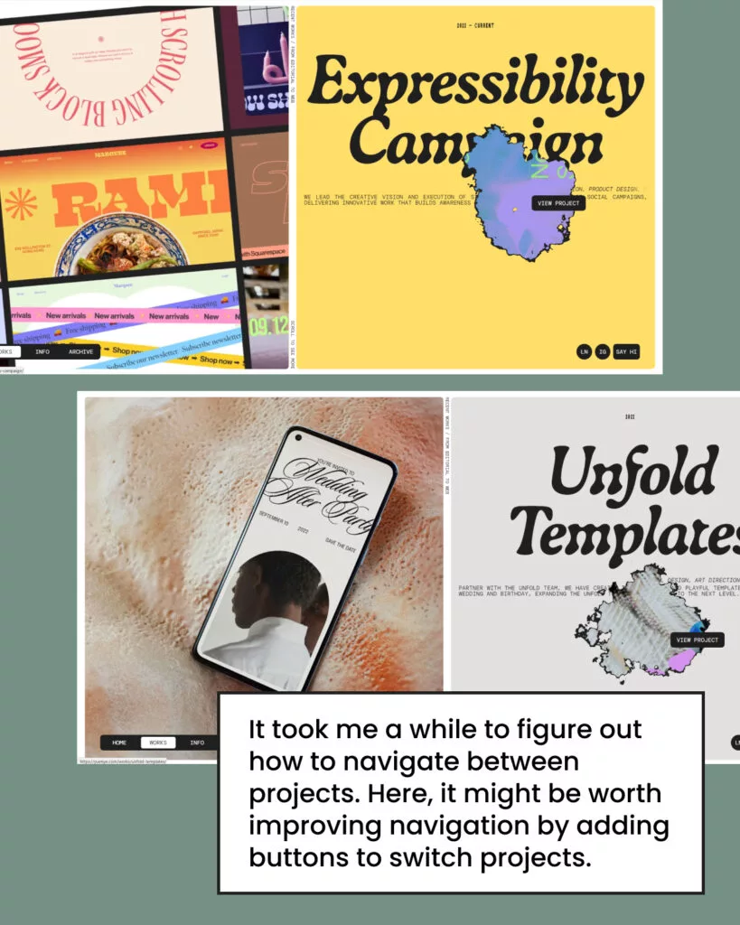
I also really liked the unusual hover effects. And moving to the “Works” section, we see the designer’s portfolio. However, it took me a while to figure out how to navigate between projects. Here, it might be worth improving navigation by adding buttons to switch projects.
Creating such an unusual site definitely makes it stand out among the web pages we’re used to. To present your personal brand, it’s important to move away from the standard site structure, creating unique sections and highlighting your own style.
However, when designing your portfolio, it’s important to consider your target audience. If your goal is to attract the attention of serious companies in fintech or medtech, then overly unusual visual solutions may not work in your favor. But if you’re aiming to work with creative companies or people who value uniqueness and want an unforgettable site, then this approach is definitely the right one.
Well, did this stick with you as much as it did with me? You have to admit, it’s very creative work! There’s something to note for future projects. I believe this website serves as a prime example of how to effectively promote an individual’s professional brand.


