
If you’re going to create a helpful and user-friendly digital solution, you’ll need helpful and user-friendly software. We strongly believe in the importance of a comfortable environment. But how do you choose the right design app that has all the necessary tools at your service?
Let us try to shed some light on this issue. We’ll review the most popular design platforms:
Photoshop, Sketch, Adobe XD and Figma
and compare them from the standpoint of UI/UX designing capabilities.
The post is kind of lengthy, so, for those who can’t wait to find out all the answers:
- Photoshop, Sketch, Adobe XD, Figma – explained in a few detail with a breakdown of pros and cons;
- Stages and parts of the design process: Which app is better for each one;
- Public opinion – 2021 results;
- Conclusion and summary.
TL;DR: Design apps comparison – Results. We love Figma. Sketch and XD are cool, too, but they have some issues. Photoshop is a great tool but for something other than UI/UX.
To put it simply: all modern versions of these (and many other) platforms support enough for you to design pretty much anything. You could write an article in Photoshop or draw a prototype (likely a horrible one) in PowerPoint, but why would you do that?
That simple question explains the point from which we’ll run this comparison: how easily can you create a UI/UX design in each of the four? What would be the strong sides and the drawbacks of the platforms?
Everything boils down to the convenience of the sets of functions for this particular task. If you want to make sure for yourself, you’d get the most accurate results by trying to work in all of them. Figuring out your opinion based on the field-test experience is the best way but that would require way too much effort.
Unfortunately, not everyone has the time and willingness to get themselves busy with at least four extra projects. We’ll spare you the trouble and tell you what we’ve found on that point.
What are they exactly?
Before delving into the pros and cons of any of the mentioned software, we’ll explain the terminology briefly. Let’s agree that the proper way to call this squad of four is “designing platforms” because they are like a workplace. Compare it with tools that are what you work with on that platform. In other words, Photoshop is a platform, and Magic Wand is a tool.
Sometimes, though, we may call them tools in this post. By that, we mean they serve as a tool for creating an interface or a piece of graphics and so on. So, instead of putting an asterisk each time, we’ll say it’s a simplifying wrap-up trick and move on, keeping it in mind.
Having said that, we’re glad to introduce you to all four apps! Let’s go one by one and start with…
Photoshop
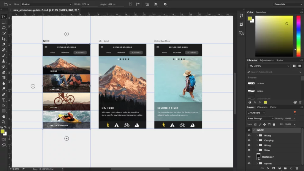
Photoshop is probably the most well-known designing platform even among people outside design. And that’s no wonder: it was introduced as long ago as in the 90s. The app has so long been the industry standard that its name became a verb for image editing. Old but gold, as some may say.
But what about the UI/UX? Well, they don’t drag behind the competitors and provide the functionality for that as well. With the recently introduced prototyping and the Creative Cloud for collaboration, Photoshop lives up to its fame as omnipotent software.
However, you’ll need to struggle to put together a decent prototype in Photoshop. We’d say (and we’re sure many would agree) that it’s a waste of time. Trying hard to create a prototype in Photoshop, when the same job in other software dedicated to the UI/UX design takes only a fraction of that time Photoshop makes you spend – that’s a no-go. But more on that later.
While it provides tons of functions, the app also requires a lot of resources from your system. Your computer must be a powerlifter for you to run Photoshop with no significant lags and glitches. And we can excuse it due to how much you get in return. Only one thing to bear in mind: an abundance of tools and options doesn’t always mean each of those will be top-scale. Graphic editing tools are second-to-nothing, but prototyping could be better.
Some people object to using Photoshop for the same reasons others wouldn’t want to stop working in it. How is that possible? It’s all because of a highly demanding learning curve. Photoshop is complicated indeed, but once you get the hang of it, you grow almost omnipotent in designing. Thus, many long-time Photoshop stalwarts are the last ones to switch to the other platforms, even though they know it’s for their own convenience.
As it was in the beginning, Photoshop was aimed more at non-web graphics rather than those for the web. That explains that exporting files in a web-ready format can sometimes be tricky. However, there’s a helpful option called Save for Web. It still doesn’t eliminate the need to specify a lot of parameters, but you can do it, which is nice.
What’s good
Cross-platform app
Unlike the counterparts like XD or Sketch, Photoshop works on almost any popular operating system of any version. You can even install it on Linux comparatively easily, and that clearly speaks in its favor.
All-in-one design app
Photoshop has a tool for anything related to design. Some things are missing, especially in terms of UX, but all the basics are in place. Using only this app, you can create an interface, populate it with visual and textual data, edit the images and export the result in different formats. You’ll face some restrictions on the way, but you’ll surely have enough to create a high-fidelity prototype from scratch.
Raster graphics editing
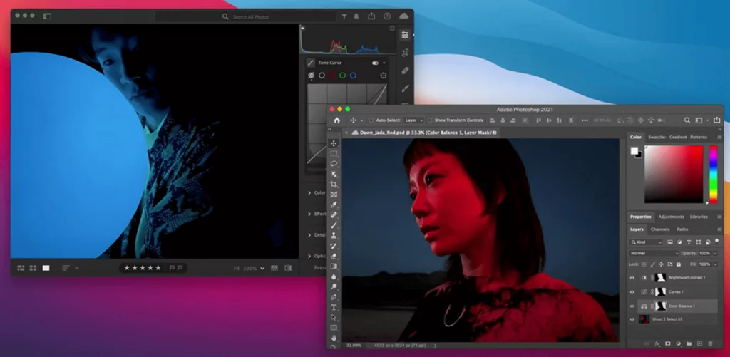
In working with graphics, Photoshop is without a doubt the best app among these four. Since Photoshop was initially created as a graphic editor, no surprise it’s the best in the industry: it had more than 30 years to develop into the biggest player in this field. You can draw with all the necessary tools available, you can make GIFs, and the Neural Filters, especially the recent 2022 release, brought it onto a whole new level of graphic editing. Photoshop is where you can let your creativity unfurl.
What’s not so great
Memory hog
With all the features the app provides, the platform becomes a massive RAM-consuming and heavy load on your computer. We can call it logical because you can’t get an all-in-one tool that’s lightweight and doesn’t eat up all the memory. There has to be a tradeoff: either you get a lot from a memory hog, or you limit yourself to the most needed stuff but save some space and RAM.
Far-from-friendly interface
Mastering Photoshop is a struggle. It’s difficult for new users to get used to the interface, to find tools and options – not to mention using them; this app is a puzzle for those new to it. The mere look of it is somewhat intimidating:
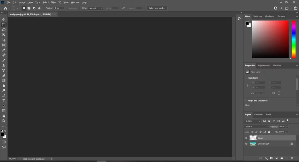
Many agree that Photoshop’s interface is not intuitive at all. Hence the learning curve and the lack of efficiency in the work.
Troubles with interdependent object relations
If you work with Linked Smart Objects, they would all automatically update after any change you apply – as long as you specify so. But should you decide to tweak a style or some other elements supposedly tied together, you’d have to do it as many times as it appears in your project.
No user flow animation
This one is crucial. Without this feature, you can hardly call your prototype a prototype because it’s completely static. No micro-interactions, no page transitions. It’s not going to make up a good UX design, and you’ll have the additional struggle of communicating your idea to developers instead of simply showing it. Technically, you can install After Effects to add some interactivity to your prototype. But that’s a whole separate app, and it surely doesn’t count as a Photoshop feature.
Really limited live collaboration
As of 2022, the latest update that brought the proto-version of live editing into Photoshop was the one of October 2021. Not hard to guess that it’s still a work in progress – and, paying them due credit, Photoshop experts did some considerable job on that. Photoshop users can now try the web beta of this app and edit, collaborate, comment, and otherwise experience the benefits of working on designs in team. To quote Photoshop directly,
Make quick edits, retouch, and adjust images with Photoshop on the web beta. Limited editing features include simple layers, selection tools, masking, and others.
Feature summary | Photoshop, October 2021
Sounds great if we keep in mind there was no such functionality in Photoshop before, but the app is seriously behind in this as compared to other design tools. We’d say this is not enough for working on a website design, especially for teams. But Photoshop never called itself a prototyping tool – so, it is what it is.
Photoshop summary:
You can use it for the entire cycle of designing a web product: it has all the necessary features for that. But it would be better to pair it with some other platform where you do all the UI/UX, using Photoshop only for the images and graphics. It provides literally everything you need to draw and edit the visuals and by far outdoes the other three apps in that regard. However, all the competitors perform better in the interface design tasks. So, we’d say that being able to do something doesn’t always mean you have to, and this something would be prototyping in Photoshop.
Sketch
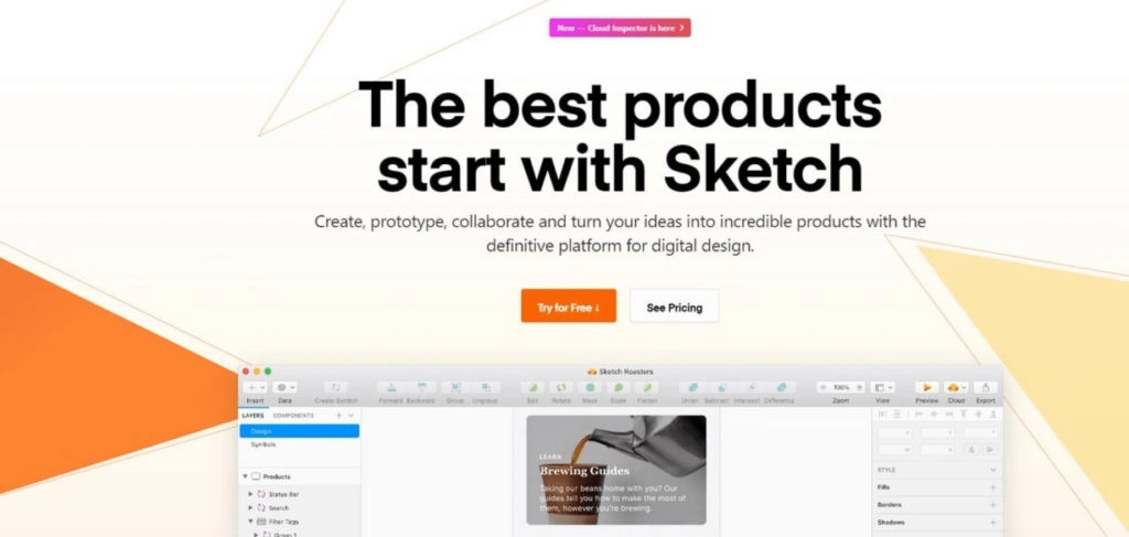
Sketch was created specifically for designing websites and other digital interfaces. After the launch in 2010, it grew into the most popular platform for UI wireframes in five years. Back then, it was hands down the best solution for UI/UX design. In a few years, competitors came into being and did a great job on providing the same and more. Now, people know the app as an easy platform with almost no learning curve, but the tradeoff is that it doesn’t provide too much without plugins.
That’s not to say Sketch is bad. It is still the top choice for web design. The four resizing options – Stretch, Pin To Corner, Resize Object, Float In Place – are what designers love about working with groups of elements in the app. Recently, Sketch introduced Assistant to help you in your work. This Assistant shows you suggestions and red/green light alerts to visualize how you did with a particular element.
On top of that, they’ve done an impressive job keeping up with the competitors. Looking at Figma, they finally introduced live collaboration: if your Sketch app is no earlier than v. 71 and you have a Team subscription, it’s available for you to try. Besides, the Cloud Inspect feature introduced early in 2020 allows for easier developer handoff (though it still works better with Zeplin and Avocode). They’re definitely putting enormous effort into catching up with Figma.
There are not too many subscription options for Sketch. You get a free trial for a month, the annual fee is $99, and then you either go for free without updates or for $79 with them. Using all the perks, you can save some money and spend roughly around $60 a year, as long as you’re okay with going one out of three years straight with no updates. That would make up the lowest monthly rate (except for the free plans), but then again – all the plugin costs.
Here we’ve come to the plugins. They’re the virtue and the vice of Sketch. There are tons of them, and anything you can’t do in the generic version of the app plugins can handle. The catch is in the cost: you’ll have to spend additional money for additional functionality.
What’s good
Huge toolkit available with plugins
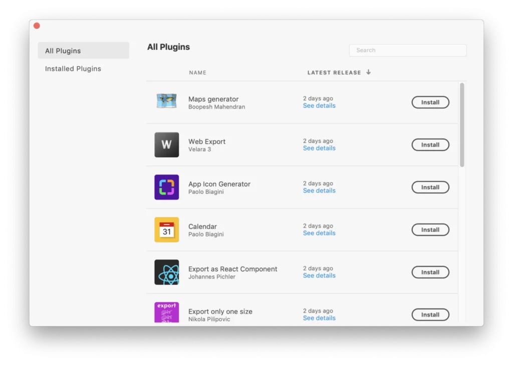
Of course, the vast majority of the cool tools come from plugins. But they still are there! When you lack something in the app, you search for the right plugin that does the thing, and that’s it – you got it done. Just keep up with the updates, and you’ll be fine. Most likely, even with the additional costs, you’ll not exceed the average budget a designing platform requires.
Assistant
Along with your work process, you get tips and suggestions to get better results. If Assistant sees something you can improve, it displays a notification with a red light. Once you’ve passed all the checks and everything is looking healthy, it turns green.
Pricing
Yes, we keep in mind that there are free plans for other tools. But they restrict some of your work. So, if you want to get an app in all the beauty of its capabilities, you’ll have to pay. Sketch has the most affordable pricing of all four, and it’s not even a subscription fee – it’s a one-time payment. And your plugin costs depend on your needs and preferences.
Convertible format
A serious advantage of this app is its compatibility. You can argue if Sketch is the one to be praised for that, or it should be its competitors that have adapted to the situation, but it is what it is. You can open Sketch files on all the three others: Photoshop, XD and Figma. For Photoshop, that would require saving your Sketch project in .psd; the other two just import it.
What’s not so great
Rudimentary live collaboration
UPD: After their release of version 71 of 2021 and later updates, it’s not as rudimentary anymore. It just makes you do a bit of preparation to enjoy all the benefits of teamwork.
Recently, Sketch introduced real-time collaboration: it was first in beta, and now, it’s an integral part of the platform. However, the feature requires a subscription for the cloud services – the Mac-only license wouldn’t suffice in this case. Besides, as we mentioned above, your version of the app needs to be 71+, and there’s some setup work you need to do before you start collaborating.
Prototyping lacks features
The new versions appear so often that we can almost call all missing features a work in progress. However, there’s still something Sketch doesn’t have: if you want your prototypes to show micro-interactions or to animate user flow somehow other than with a slider effect, you would need to go a bit above and beyond: install an third-party plugin or use pro-level tricks. For instance, a fade-in page transition effect would require creating multiple layers with different opacity on top of the start page.
UPD: Prototyping is now available in live collaboration mode, and Sketch versions 88 and 89 came with a few improvements like linking artboards automatically, hew handy hotkey combinations, better collaboration features (though still beta rather than alfa, so to say), etc.
Sketch summary:
Sketch has been the choice of many for more than five years, especially in 2015, and it still is. It does what you expect from it, and we like to call it a good workhorse. Plugins take it to the whole other level and make it one of the leaders in the web design industry. But they need to improve the collaboration and sharing aspects – other than that, it’s an awesome app.
Adobe XD
XD is a fairly recent Adobe release, with which they aimed to get into the niche of UX design. The world first saw it in March 2016, and since then, they’ve been doing some intensive catch-up work, including the recently added Coediting feature. The updates appear almost every month, which allows this platform to add more and more handy features for UI/UX designers.
The name of the app comes from Experience Design, which clearly tells what it is for. People call it Photoshop for prototyping, and it perfectly describes its capabilities. Adobe XD is built to be an all-in-one design platform like its widely known predecessor, but with the specification in the web design. Everything that was clumsy, cumbersome, and awkward to handle in Photoshop UX-wise is much more conveniently implemented in XD.
Talking of the experience: XD itself has quite an easy-to-use interface. It is similar to Figma or Sketch – you wouldn’t have any problem switching from one to another. Also, it opens Photoshop and Sketch files, which is yet again something to make your life easier. As an Adobe product, XD will look familiar to people who worked with some other apps from the family. Ever heard of courses that go: “Learn *some_skill* in a day”? You can honestly say something like that about XD.
XD focuses on providing more built-in functionality – making all-inclusive solutions is a signature Adobe style. But this app has surprising shortcomings: more on that below and in the tables.
What’s good
Free plan
Generously enough, Adobe provides a free plan for using XD. It gives you the opportunity to get the grips of working in it and see for yourself if you like it or not. However, free always comes with restrictions. In this case, they’re quite noticeable:
- Only one shared link for prototypes;
- Only one shared document;
- A maximum of two editors collaborating on a document;
- Limited cloud storage (2 Gb vs 100 Gb with a premium plan);
- Limited font set;
- Version history is available only for 10 days.
Of course, it doesn’t mean a free plan is nothing at all. You get a fully functioning app with everything you need as a single designer. The scale of work is where you face the boundaries.
Variety of triggers for prototypes
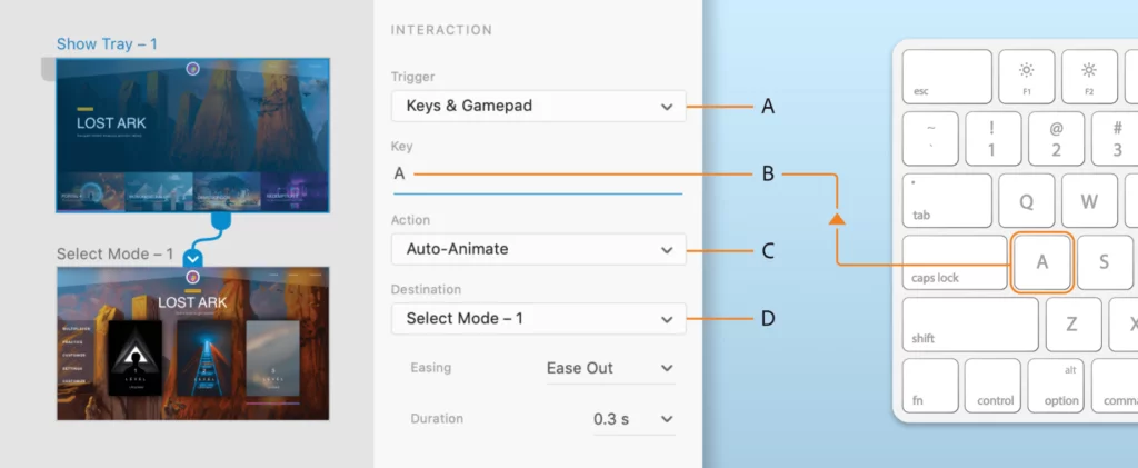
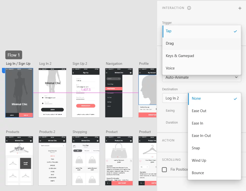
XD boasts its ability to create highly interactive mockups. The famous voice trigger that they added to their prototypes is definitely something. It’s not among the most used features, but it’s certainly impressive and helpful. Apart from that, XD understands keyboard and gamepad triggers, auto animate the motion visuals and other cool features for presenting the work in all its beauty and testing it in every aspect. 2022 also brought us the update that allows creating prototypes with multiple time triggers.
Repeat Grid
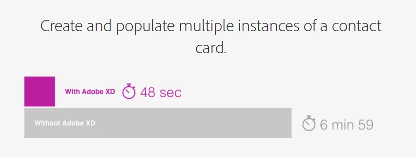
If the previously mentioned features are debatable must-haves (many designers agree that they aren’t that necessary), Repeat Grid is a more usable option. It allows you to create multiple instances of a design with no copy-pasting. You select an element on your canvas and drag the border: the further you drag it, the more copies you get. Then, if you need to make changes to it, you only have to change one element – the rest will update automatically.
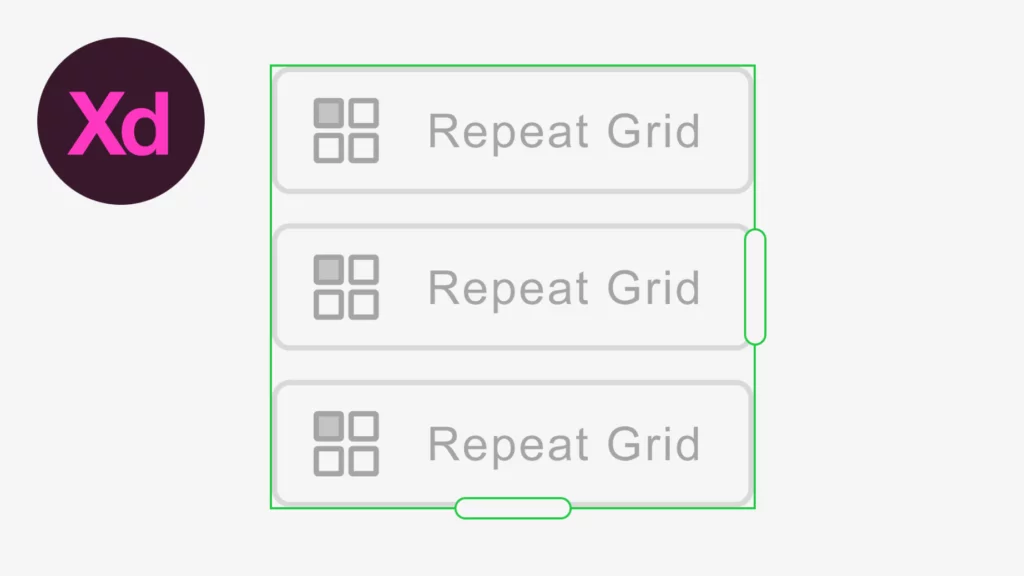
This replication mode increases the speed of work significantly. Adobe provided nice infographics where they showcase the results of benchmark tests performed on XD. Most of the comparison was run with Photoshop as the counterpart, but other competitors are also a bit behind XD in this.
Animated Prototyping
Animation of the prototypes is the strength of this app. You can select from several transition effects like Ease In or Out and what have you. The Auto-Animate feature enhances the user flow presentation in prototyping measurably. And the fact that you can easily export videos is also a solid plus.
What’s not so great
OS requirements
Since the app is relatively new, you can only install it on the modern versions of operating systems. It’s not exactly any sort of a major problem, but it does impose some restrictions. iOS has to be 10.14 or above, and Windows must be 10 or above. XD also works on some new Android versions with Open GL ES 2.0.
Ugly export
People face various issues like struggling to export in a certain format, getting blurry images and texts in the resulting files, etc. A designer needs to look for ways to work around the in-app problems. The platform is supposed to make the workflow streamlined, not bumpy.
UPD: Among the improvements of the version 50 (2022), there’s easier asset management with paths so that you can organize them the way you like. That’s not exactly a fix of the problem mentioned, but they do look in that direction: many of the known issues were fixed in 2021-2022 releases. So, we can say they actually try to hear users as they claim on their website.
Beta Coediting & Weird setup
Same as with Sketch, you don’t just start collaborating – or coediting, as they call it in Adobe. First, you set up your cloud environment with all the works, then you personally invite your colleagues over an email (meaning that you send out actual invitations), then you enable Coediting, and finally, you’re good to go and collaborate. Again, it’s great enough they have the feature at all, but still, there’s a lot of room for improvements.
Adobe XD summary:
With everything it has and works on, XD is a great workhorse. It has lots of good things for UI/UX design and keeps up with the market and competitors quite successfully. What we find slightly confusing is that with all the incomparable features like voice triggers, they’re missing some more essential stuff. Hopefully, it’s going to be taken care of, and the app will rise and shine with an added vim.
Figma
Out of all four, Figma is the youngest app, though XD is only half a year ahead of it. Considering their success so far, they’ll be the new standard app in short, if not already. This is not a mere trend: Figma was the first in the industry to introduce real-time collaboration and other cloud functionality available by default, and that is a big deal.
Figma is web-based, which means you’re platform-independent while working with it. Yes, you can download desktop apps for iOS and Windows, and there’s even a non-official app for Linux, but you don’t have to do that.
Apart from what we already know about Figma’s innovative approach to design, they as a company are quite outgoing. Figma organizes events to push people to invent more and more cool digital design solutions, especially plugins (not exactly a success yet but some decent work in progress). It provides a subscription for Education teams, which is both all-inclusive and free. And they go beyond that in helping students with their bootcamps and educational YouTube channels – more on that in our post about Figma’s student programs.
That’s a sweet way to advertise for oneself, isn’t it?
So far, people rarely complain about Figma – you’ll mostly hear praises from all and everyone, which is some evidently good sign. It does consume quite a bit of RAM, but it stays within reasonable and compares to the competitors’ rates.
Surprisingly enough, you don’t experience too many lags and glitches while working in it, though you may expect that from an online service. In fact, it performs better than Sketch, not to mention Photoshop – at least according to what they say with their fun visual proofs and to the designers’ impression.
What’s good
Cloud service and live collaboration by default
The second name for Figma is Google Docs for Designers, which explains everything more precisely than any long description would do. Being web-based, Figma makes an even greater pair for WordPress in building web solutions, not to mention it allows to conveniently convert designs into live sites.
Logically, if you work online, you can bring other people to work together with you. And they don’t have to be editors: you decide who gets which permissions. Invite your clients to comment on the project or any specific parts of it. Invite developers so that they start their engineering and keep pace with your progress. And, continuing the collab setup topic we raised talking about the competitors, it doesn’t require any additional effort on your part – you simply enjoy the privilege.
Dev-friendly designs
The Export tab in Figma is a huge help to developers who take the work from the designer. There, they can find the necessary code properties for each object and copy it right away. The whole workflow is built around the idea of seamless development handoff – especially with the updates of 2022, providing such features as a redesigned auto layout and component properties.
Figma Branching
This feature is a kind of a moodboard combined with Git functionality. That is, you can brainstorm ideas and improve your existing design without meddling with the original file. While you and your team ideate the new features, the design itself remains intact – until you decide to apply the changes. So far, the feature is only available in beta and for teams on the Organization plan.
Free plan
Figma provides most of the functionality for free – at least, as long as you work alone or in a pair. In other words, the free plan is enough to do pretty much everything you might need for designing. There are some limitations like:
- Only three projects
- Only 30 days of your version history gets saved
- No shareable libraries
But you have unlimited cloud storage at your disposal, and you can invite viewers. So, the plan is pretty generous. Larger teams, however, would need one of their pro plans, which is from $144 per person per year.
Work with symbols
Symbols are extremely important in creating a consistent UI/UX design, and the easier it is to edit them, the more efficient your work is. Figma as a platform provides the most convenient work experience when it comes to creating components (that’s the name for symbols in this app). Similar to what you can see in other designing platforms, the symbols are interrelated by parent-child relations. This hierarchy allows you to quickly create multiple instances of an element and edit only the parent to apply changes to all. Figma takes it a bit further and enables you to edit the child elements as well. If you do so, you’ll get a notification asking whether the changes should apply to all the elements from the family.
Vector Network tool
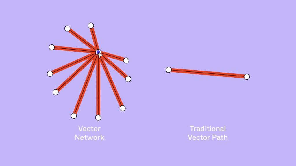
Working with a regular Pen tool, you need to mind the direction of all vectors you’ve drawn. With Figma’s Vector Networks, you can connect any two dots anywhere regardless of the direction and with no additional paths. So, you can connect several lines in one spot, which could be trickier without Vector Networks. It helps create vector drawings faster than normally, be it with a Shape tool or with the Pen.
+ FigJam
One can argue if Figma’s whiteboard tool FigJam is a good thing or not – we did and came to a few interesting conclusions when comparing it to Miro. But it’s there, and it goes well with the rest of the effort which Figma puts into building a handy environment for building websites.
What’s not so great
Figma can’t open files offline
This is the downside of cloud-based work. You need to have internet access to open any of your previous work. However, once you’ve opened it, you can work with no connection – again, as long as you don’t need to search for anything in your Library. Yet another similarity between Figma and Google Docs!

Some plugins are work-in-progress quality
The number of add-ons for Figma keeps growing and improving in quality. Figma encourages developers to work out new additional functionality and sets quality checks to ensure the product is fit and healthy. However, we recommend you trust only the tried-and-true options – at least with important projects. Make sure you know how (and if at all) the plugin works before using it for work. But all this is not to scare you: there are hundreds of awesome and highly functional plugins for Figma. It’s just that you should stay cautious.
Figma summary:
Figma is a perfect option for a primary designing tool. Prototyping is phenomenal, especially considering how painlessly you can hand your work off to the dev team. It provides everything needed for the UI/UX design, and your only reasons not to choose it could be either poor internet connection or the lack of money if you’re bringing together a big team of designers. And even in those cases, there are things to compensate for the problems: there are desktop apps to set off the former, and collaboration is so seamless that the latter will also be worth paying for.
2021 Survey: Design Apps Comparison
Apart from our opinion, we have some survey results for you. The UXTools portal provided the 2021 Design Tools Survey – a rating with ample comments in each section based on public opinion collected from the designers. They analyzed multiple aspects of the web design process and the most popular tools for them. To give you a taste of the results, we took UI design and prototyping – here are the top 5 tools for those:
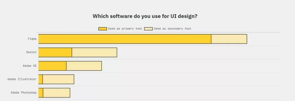

One can say the results meet the expectations – we’d agree. But your opinion can be different. We’ve analyzed all the features of the biggest apps on the market so that you could figure out what you think of each of them. Now, as we’ve reviewed all the apps separately, let’s make it more competitive, shall we!
Web design comprises lots of things, and each of our four contestants may suit better for this or that. It can be more helpful to view the apps from the perspective of the work process and bring them against one another in that way.
You’ll see quite a few tables – hopefully, it will help us get the point across. Also, everything in these tables relates to the latest versions and updates. Older versions may be – and mostly are! – totally different.
Note: plugins compensate for most of the shortcomings of the generic app version, regardless of which one we’re talking about. On the other hand, that means you’ll have to pay additionally for each one of the bells and whistles. For that reason, we specify which functions are shipped only with add-ons.
And let’s begin!
Design apps compared: Detailed workflow breakdown
Prepping up for the work
| PS | Sketch | Adobe XD | Figma | |
| Platform | Cross-platform | iOS + web-based | Newest iOS & Windows, Android | Web-based |
| Resource consumption* | 3-4 Gb; 8 Gb RAM | 4 Gb; Up to 2 Gb RAM | 2+ Gb; 4 Gb RAM | No storage space; ~2 Gb RAM |
| App’s speed of response | With a considerable amount of lags | With lags | Moderate performance | Response close to immediate |
| Intuitive interface | Not intuitive at all | Intuitive | Intuitive | Intuitive |
| Cost per year | From $240; Free trial (7 days); All Creative Cloud products for $636 | From $99 1st year, then $79 for updates; Free trial (30 days) | Free starter plan; Premium – $120; All Creative Cloud products for $636 | Free plan; Pro plans from $144 per member |
| Learning curve | High | Low | Low to medium | Low |
*Assuming that you work on a moderately big project and save the corresponding amount of data in the app.
The most demanding app is Photoshop. It requires the most resources from your computer, and working in it supposedly results in more time spent. Sketch turned out to be the most lightweight of the four apps, but lags are still there. Figma tends to perform better in that regard. It barely beats XD – mainly because the resource consumption/performance ratio looks more appealing.
Photoshop is the only one in the group that looks different from its counterparts. It makes sense for many reasons:
- The app is more of a platform for graphic designers rather than a prototyping tool.
- It’s been with us since 1990, and dramatically changing the interface could be frowned upon by the loyal users.
- It’s meant to be an all-in-one tool – maybe, a less friendly interface is a reasonable tradeoff.
That is to say that the learning curve for it is the most terrifying. Others are about equally simple to master, but many designers agree Sketch and Figma are the most convenient ones.
Depending on what your circumstances are, the most accessible platform can either be Photoshop, as you can install it on practically any OS, or Figma, as it works from any modern browser. The deciding factor is your internet access and the speed of it.
Organizing your design environment
| PS | Sketch | Adobe XD | Figma | |
| Multipage projects support |   * * |  |  |  |
| Artboards (frames) | Can’t save all files of a project on one artboard; No nesting | No nesting | No nesting | Nested frames |
| Assets | View in the folder | Exportable elements & slices | View in the tab | Select to show |
*Requires packing artboards as Smart Objects.
The best apps for creating page mockups are Figma and Sketch. The only asterisk note for Sketch is that it stopped the support of nesting artboards (unlike Figma that promotes them), which is not always convenient.
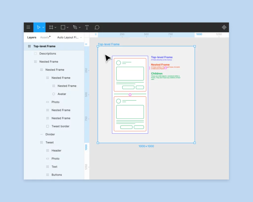
Neither does Photoshop or XD, and both of those have troublesome multipage project functionality. XD just doesn’t let you create a multipage project, and Photoshop requires additional artboard processing – if you wrap them up as Smart Objects, you can make it somewhat close to multipage.
The support of multipage projects is not a must, but it can help you a lot in organizing your work. If you plan to have multipage projects, Sketch and Figma will serve you better from that standpoint.
All apps can save assets of your UI kit elements, but the implementation of this feature is different. Sketch took an interesting approach and provided two forms of assets you can export: slices and exportable elements. When you create slices, you:
- choose if you want them with the background or not;
- can keep transparent pixels or trim them;
- get them placed on a separate layer.
When you create exportable elements, you get them:
- with no background;
- with the dimensions equal to those of the original component;
- on the same layer from which you export them.
Slices and exportable elements are interconvertible: so, you can always change the format if you need it.
Figma and XD both allow you to export assets. The former will let you choose if you want to view your project by layers or by assets – a one-click action. XD shows assets on the Assets panel under the dedicated tab – same as with Figma, simple and handy. Photoshop puts together assets, too, but shows them only in the folder where it saves them when exporting. That’s not the most convenient way. However, there are plugins for Photoshop that compensate for this lack – you can have this problem solved.
Functionality
Layout
| PS | Sketch | Adobe XD | Figma | |
| Grids |  Have to create | Square AND column; Pixel grid | Square OR column; Repeat grid | Row AND column; Pixel grid; Apply any number of grids Can save yours |
| Layer size | Coordinates | Can calculate (+-*:%) | Coordinates | Coordinates |
| Object resizing | = Re-do (can’t fix width or height) | Easy (keeps % on the screen resize) | Auto-mode for responsiveness | Can’t resize a group, but can do it with nesting |
| Text alignment and justification |  |  |  |  (separate from style) |
Columns and grids are incredibly helpful for building layouts. With most of the apps, you’ll have no problem creating one; the only exception is Photoshop. Working in it, you have to create grids yourself, and that takes unreasonable time. The others have templates you can simply select and apply. In XD, though, you only get to choose one of the two – a square grid or columns. Sketch allows you to apply both at the same time. Figma also puts no restrictions on how many grids you add to a frame.
However, XD has a significant advantage – the Repeat Grid function. It is a fast way to create multiple instances of the same grid. The Adobe website provides a list of contacts as an example of repetitive elements:

This can save you a lot of time and is a serious competitive advantage: as of now, XD is the only app that has such a function.
All the latest versions of these platforms have an in-built set of artboard (frame) templates with the dimensions of the popular screen sizes. Interestingly enough, they vary from one app to another, which means you need to pay attention to the width and height anyway.
Sketch is the only one of the four apps that can calculate the size of a layer using addition, subtraction, multiplication, division or percentage. This adds to the overall flexibility of prototyping.
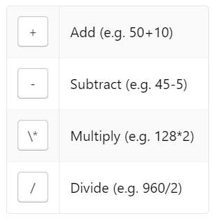
When it comes to resizing elements, you can find the most convenient functionality in XD. It offers an automatic resizing mode that predicts the object position on canvas and hence, their size.
“In Auto-mode Responsive Resize will predict the placement of elements based on relative positioning on the canvas, automatically resizing elements, and repositioning them for a larger or smaller design.”
Howard Pinsky, Senior XD Evangelist, Adobe
Automated solutions mean some tedious work off your shoulders, but sometimes you still need to check the results and tweak them here and there. That being said, Sketch is by no means behind XD in resizing. It provides everything for you to change the sizes of objects or groups conveniently. Especially the fact that Sketch understands percentages speaks in its favor. Figma can’t do that and behaves slightly annoyingly when you try to resize a group, but their nesting frames are even better than groups for this purpose. So, not too bad.
Photoshop did worse here compared to the others. Unlike in Sketch, XD or Figma, you can’t fix the width or height of an element while resizing things on your artboard, and in general, resizing a group means redoing that part of the project.
Text alignment (top, center or bottom) and justification (left, center or right) can be tricky with XD. In Figma, you can do it with no problem, but you can’t save these properties as a part of a style. They claim it enhances the convenience of changing these parameters in single segments of the text in the project. Sketch and Photoshop behave more conventionally and allow both setting text alignments and saving them together with this style.
Tools and options
| PS | Sketch | Adobe XD | Figma | |
| SVG | Poor; More bitmap-oriented | Vector by default; Highly precise | Good | Good |
| Drawing | Best; Rounded Rectangle tool | Generally a bit more difficult | No polygon tool | Vector networks |
| Animation | Best for motion graphics creation | Mostly rudimentary | Better for prototyping | Better for prototyping |
| Color management | Great | Poor | No (wrong display on Macs) | Moderate |
Vector graphics
As Photoshop is more of a bitmap editing tool, it’s not as great with vector graphics as the others. You can create and edit SVG images on this platform, but it’s not as convenient, and the toolkit is not that versatile. It may be challenging to rate the other three apps, as they all manage vector graphics well.
In Sketch, all images are vector by default, and it tends to perform better than XD in working with them. But there’s no significant difference. Figma boasts its Vector Networks, which eliminate the need to mind the directions of paths and allow for more flexibility. This can be listed as an advantage: you can build more complex shapes without creating additional paths.
Creative drawing
Graphic design is where Photoshop is a hands-down winner. It’s the best platform out of this group if we talk drawing. But then again, none of the other three apps are meant to fulfill this purpose. The Photoshop drawing tool loved by people the most is its Rounded Rectangle, as weird as it may sound. It’s the best tool for making and editing the rounded angles for the shapes. It takes the headache away from you if you need to draw and, especially, re-draw some rounded shape (like a button). XD, for one, has no polygon tool at all, and Sketch lacks convenience in its drawing functionality.
Animation
If you plan to create animation, you should choose Photoshop (at least, compared to the other three). We can say that anything related to creating graphics, be it motion or static, is going to work best with Photoshop. XD and Figma are the stars of animating prototypes, but not in making motion pictures. Sketch is not as good as those apps in either type of motion design.
Color management
Similarly to the other aspects from this chapter, color management works better in Photoshop than in the rest of the group. XD’s known problem is the way it displays colors on Mac computers, and Sketch and Figma are also not outstanding in that regard (but plugins improve the situation).
Tools
The most impressive variety of tools we see in Photoshop. It comes with literally everything you can imagine, even though some things can be better in other apps. To be fair, this multi-purposeness results in a cluttered toolbar and menus, where one would struggle to find anything. The other apps have friendlier editor interfaces. They provide less, though – tradeoffs are inevitable!
Work with content
| PS | Sketch | Adobe XD | Figma | |
| Multiple effects |  |  |  (1 per object) |  |
| Styles | Layer, Paragraph and Character styles | Text and Layer styles | Can’t save a set of properties as a style | Cascade styles |
| Image editing |  |  |  |  |
| Symbols | Linked Smart Objects change automatically | Separate page for symbols; Changes in the original apply to all instances | Copied = linked; Notification about changes; Can’t change a child element | Master/instances; Notification about changes |
| Typography | Good | Difficulties with glyphs | Supposedly the best | Good |
| Dummy data | Import from Excel | Built-in sets + you can add yours | Import of live data; Drag & drop upload | Copy-paste only |
Styles and effects
A surprising shortfall of XD is that it doesn’t let you apply multiple effects to one object. The other apps work with cumulative effects, not leaving you with just one option. Neither XD nor Sketch provide decent functionality for editing images. You’d have to use secondary software for that, and Photoshop would be an excellent choice. Figma does less than Photoshop from that standpoint but still allows for more than the other two.
Styles are interesting in all these apps. XD lets you save specific properties (say, for characters), but you can’t save them all together as a style set. Sketch enables you to do so with the options of creating Text and Layer styles. Figma with their cascade styles employs a mix & match approach: you take the small sets and combine them as you wish. In essence, it also means saving properties not as a fixed set but separately. Photoshop has styles for layers, among other things, but when you apply a style to multiple pages, all instances become independent from each other. It means, in case there are any changes, you’d have to make them for each layer separately.
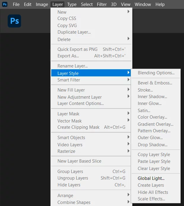
Symbols
Another type of interrelated content is symbols, or components, as Figma calls them. The most troublesome implementation of linked symbols is in Photoshop. You have to define which objects you want related, and making changes can be a pain. Linked objects work in all these apps, but Sketch has it better than the others, with Figma running super closely and XD being not too far behind, too.
In all XD, Sketch and Figma, you’ll see the master-instances symbol hierarchy. However, you can’t change an instance – a child element – in XD. The nice thing about this platform’s approach is that an element copied is an element linked. So, you don’t have to bother tying them manually. Sketch keeps all symbols on a separate page, which is a huge help in organizing them.
Typography and dummy data
Character properties and fonts are overall sufficient in all four apps. Sketch’s slightly more problematic when it comes to working with glyphs, but other than that, nothing is significantly off-putting. Many people mention XD has it the most convenient – that could be a matter of taste.
Apart from Figma, all the apps allow you to import some data other than the odious Lorem Ipsum to see how your design looks with the text. Sketch and XD can share the first place here: the former comes with built-in sets of data you can use, and the latter allows you to drag-and-drop whatever you need. Photoshop reads Excel data, which is also handy compared to Figma’s copy-pasting. Probably, the first battle lost by Figma.
Prototyping
| PS | Sketch | Adobe XD | Figma | |
| Active links/buttons |  |  |  |  |
| Animated user flow |   (with Auto Effects) |   (with plugins) |  |  |
| Micro-interactions |   (with Auto Effects) |   (with plugins) |  |  |
| Trigger variety |  |  |  |  |
For both Sketch and Photoshop, animating the user flow and showing micro-interactions requires additional solutions. Sketch has it more convenient, and such mockup-enlivening functionality comes in plugins. Photoshop is only capable of such things with Auto Effects, which is another Adobe app: it’s extra costs, but it gets the job done. The other two, Figma and XD, handle this on their own with no need to install any extra add-ons. XD also provides voice triggers for your prototypes, which is not the most necessary feature, but it makes the platform stand out from the crowd.
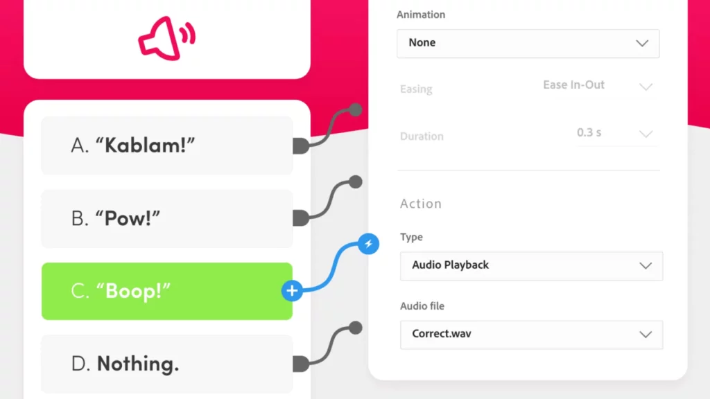
Only Photoshop from the whole group doesn’t let you create active links or buttons. It’s a weighty drawback, considering that these things make prototypes more immersive. Without them, you can’t go any further than a poor-quality wireframe.
Collaboration & Work handoff
| PS | Sketch | Adobe XD | Figma | |
| Version control |  |  (in Cloud) |  (limited in free) |  (limited in free) |
| Real-time collab |  |  (a bit cumbersome) |  (a bit cumbersome) |  |
| Share & comment |  In-app hidden comments; Slack & Trello plugins |  (browser-based) |  (browser-based) |  (browser-based) |
| Export & handoff | Good at compressing; Poor web rendering; CSS of individual attributes | Export code with plugins; Zeplin or InVision for handoff | Export code with plugins; Export as video | In-app CSS; Figma2WP |
Users can view their version history in all of the apps, but the free plans in Figma and XD limit it to 30 and 10 days, respectively. So, as one may expect, you get more when you pay extra. It works the other way around for sharing your work with others: you’ll encounter the most complications with Photoshop (the most expensive option), while Figma handles it brilliantly. Since the other two – XD and Sketch – are not web-based (at least yet), commenting in those apps may feel less natural. You also do it in the browser, but that means you need to switch from the app to the website. Not a negative point, but slightly less handy.
No doubt, Figma is the leader in the industry in terms of collaboration. It brings together the entire teams of designers, developers, project managers and other people involved in the process in live mode. Even the free plan allows two people to work on a project, not to mention the paid options. Cloud services were most likely the main reason for the skyrocketing popularity of Figma. At least, that’s what we as a team that works in Figma believe.
When the designing work is done, it’s time to start the development process. The smoothest transition at this stage occurs in Figma, as it provides CSS properties in-app and is well adapted for the web. You can get the CSS of individual attributes from Photoshop, too, but their overall web rendering is of lower quality. It gets harder with HTML: Sketch and XD have plugins that can export that kind of code from your projects, but not all of them work exceptionally well. Extracting the code responsible for structure and logic from designs is just generally complicated. What you can do (if you work in Figma) is to get help in converting Figma2WP – a seamless transition from a design to a fully operating website on WordPress.
Best design apps: Wrapping up
Based on the criteria we used to analyze Photoshop, Sketch, Adobe XD and Figma, we could put together this little rating. Warning! All scores can be (and probably are) subjective. But we did our best to judge impartially.
Results:
#1: Figma – 8.5/10
#2: Sketch – 6.5/10
#3: XD – 5.7/10
#4: Photoshop – 4.2/10
We took as much into consideration as was possible, but, of course, it was only what we found the most essential for UI and UX. For you folks, some of the things we’ve overviewed may matter more and some less. If you jumped here from the TL;DR paragraph, we recommend taking a look at the comparison tables in this section and check if you agree with us.
Final words
You can achieve a lot with Sketch when you combine it with a handful of plugins for everything you need. There are millions of them out there – you’ll definitely find something to help you. But searching for that something takes place on the internet, which is debatable convenience compared to Adobe’s interface for that. But Adobe products (same as Figma) have considerably fewer plugins available. Some may find it limiting.
However, Figma is a much friendlier environment to design alone as well as collaborate. XD can compete with it in some aspects, but the significant advantage is on Figma’s side. We as a team are a bit of fans of Figma; so, call it fangirling, but we do love working in it more than on any other platform. Convenience is key for working effectively, we’d die on this hill. And Figma is the best design app from this standpoint.
Congratulations on making it through! Hopefully, you found what you were looking for in this text, and it’ll help you make up your mind on the best-of-the-best platform for web design. We’ll supply this post with further updates when notable changes occur. Stay tuned!

