If your WordPress version is 5.0 or above, you already know they launched a new editor. What is fundamentally different about it is the block concept that changes the editing process – and for the better. So, now we have what’s called WordPress blocks.
It is a fairly recent add-on: WordPress introduced it in 2018 with the 5.0 version, and it was a waited-for launch. With this new editor, they wanted to revolutionize the experience of website editing – like Johannes Gutenberg, the inventor of the first movable printing press once did with printing (hence the name). A third-party project evolved to become a cutting-edge native editor, which we believe was only logical (we explained my reasoning for it in this post).
Though so far it has been around for more than 2 years, some may still be slightly baffled by the update. Don’t be! Feel free to have a look through our piece of assistance in switching to the Gutenberg editor for beginners.
What should we all be thankful for in the Gutenberg editor?
1. A more intuitive interface
The new editor was introduced to make our lives easier (at least while working on WordPress). And it does its job well: Gutenberg requires less coding. Instead, you have pre-built blocks with everything you need. Therefore, the WordPress development process grew even more understandable for amateur users.
Here is what they look like on your dashboard (on the left):
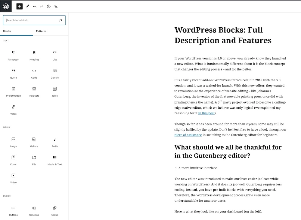
And, as you see, there is still a lot more when you scroll down.
The editor used to resemble merely a text processor. It means, this could be ok, but definitely not more than that. Now it is more visualized; the menu “suggests” ideas for your pages or posts. You may not have thought of adding, say, a calendar but came across a nice feature while scrolling through the options.
2. More possibilities
Not only the dashboard is classier now. You do certain things much easier. Our personal #1 of the new editor features is the table block. Yes, inserting tables is no longer a hideous mess. What was going on in the previous editor did not look at all pleasant. To add a table (say, a price list or some test results), you either had to go as far as writing HTML code manually or install a special plugin – and that is for such a common type of content!
Another improvement that makes us happy is a multi-column text layout. The classic WordPress editor used to make arranging text in columns comparatively difficult.
3. More features to come
Tons of plugins have already been created out there for building content of all sorts and types. The majority of them are whole sets of WordPress blocks in plugins. We have a list of a few of the most popular plugins in our blog. This post also clarifies some more pros of using this editor.
You will most likely find something to your taste among the existing WordPress blocks. However, if you are picky enough and have a very distinctive image of that particular thing you need, you can always build a perfect one for this specific purpose.
All that being the case, we see some great potential for blocks to further grow in number and variety. It is a push for all WordPress users to bring about functionality extension. The more people go creative about new plugins, the broader choice of useful features we have. Some of the long-time-favorite plugins have already turned into default structures.
4. A view from the user’s side
With the current block style editing, the page on your (admin) side resembles the user view more. Or, in other words, you see your product in its final state.
You do not have to switch between different access modes to see the result, thus you save yourself some time. We would say it helps a lot.
By the way, the editor’s new style on your side does not cause any changes in how people will see your website – you have nothing to worry about in that respect. It only provides you a smoother experience with fewer formatting issues (Remember how you lost a part of a text trying to swap the paragraphs? Happened to the best of us).
5. Reusable blocks
The capability of saving individual pieces of content for further use is a marvelous thing. That is especially true if certain snippets must appear in your content now and again. You will not have to recreate your content each time you need to post it somewhere. To save it, go to the three-dot menu in the toolbar and click on Add to Reusable blocks. You will see a popup confirming that you have created a block. Then give it a name and save – it is now in your database.
What blocks are there by default?
In short: plenty of them. In an essence, the Gutenberg editor has the most types of blocks you can think of. Arrange your text as a numbered or bulleted list, a (pull-)quote, or a verse; insert any widget; create a whole media gallery in a snap of a finger (or, better to say, in a click of a mouse).
The editor sorts everything into categories according to the type of content:
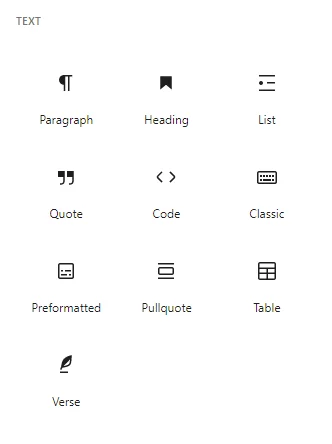
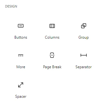
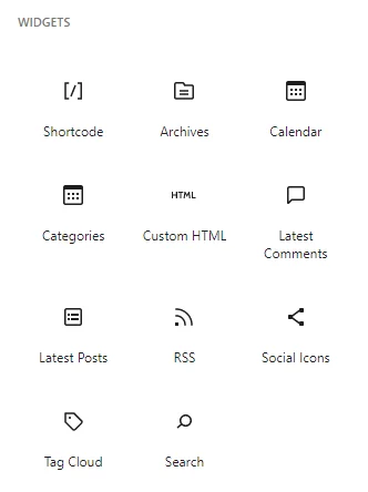
Below those, you will also find quite a number of embeds including popular ones like YouTube, TikTok, Spotify and the likes. And again, create yours by entering the URL into the provided field.
How WordPress blocks work
Generally speaking, there is nothing you need to learn specifically for this editor. Just go with the flow while working with your content – it comes naturally.
You call a block by typing / and the name of the necessary one. If you would rather get down to business wasting no time on digging into the menu, simply start writing (it is implied that after a title you have a paragraph), as the editor suggests. Block structure will form just fine on its own as you edit.
To add media files, drag them right into the page. It works even with several files at a time – in that case, the editor builds a media gallery. Paste a URL for your embed and watch the link turn into an embed block. Simple as that.
The editor also gives you tooltips describing the options. They appear as you put the arrow over an option.
Mouse and keyboard control are both possible. Some of the keyboard shortcuts for it are:
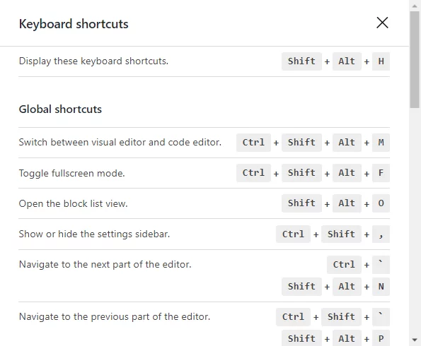
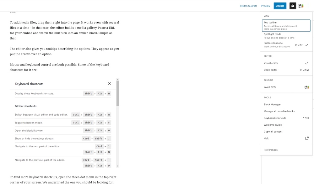
To find more keyboard shortcuts, open the three-dot menu in the top right corner of your screen. We underlined the one you should be looking for:
To do the drag-and-drop, click and hold the six dots on the block toolbar and move it wherever you prefer.

A toolbar for each block appears right next to it. Though, if you feel it is kind of in your way, pin it to the top of the screen by ticking the Top Toolbar view in the uppermost three-dot menu.
Of course, the editor still allows switching to the coding mode to make corrections in the code directly, be it for the entire page or a single block. To view everything in code, tick the Coding mode in the same three-dot menu as above (top corner). The solution for individual block code editing is Edit as HTML option – under the three dots of the corresponding toolbar.
Now there are still well over 5 million people who have chosen to go with the former style (at least as according to the number of active installations of the Classic Editor plugin). So, you would not be the only one if you prefer the old one over the new one. However, it is no actual use in doing so (apart from pure nostalgic feelings), since everything you liked about the old features is implemented in the current editor. Work as you did before – you will not even notice how WordPress blocks do their job. No need for you to be conscious of any changes.
Wait, I’m still a little confused…
If you feel like you need some background knowledge, you can check our Guide to the Basic Functionality of the Gutenberg editor.
Summing it all up on WordPress blocks
Gutenberg has brought us:
- A friendlier interface
- More convenience in adding a broad variety of content
- Incredible growth potential
- Content looks closer to how users see it
- Reusability feature
If you still have not tried the Gutenberg editor, I highly recommend it – it is an absolute top experience.


