
You have started with an idea, you thought of the details, and have created a site on WordPress. Now it is time to draw some attention. How do you stand out from the crowd of billions of others?
Branding is your key to success. You have to develop a unique style that speaks for itself. Every little detail matters: it must correspond with your message and your goals and values. The design has to be meaningful and attractive. Now, it is comparatively easy to achieve that online with all the modern tools we have. On the other hand, since it has become more doable for everyone, there is substantial competition in that field.
Making your WordPress website distinctive requires a sensible approach and a whole set of measures. It is not too many of them, but they all imply a lot of mental effort and creativity. But don’t let that intimidate you! Once you get the process going, you will gain more confidence and perspective on things.
Getting started
There is no need to explain that today being present online is a must. So, you are building with WordPress (if you are struggling with it, read our Guide on Development with WordPress). Even if you think you are not so tech-savvy, this is a perfect CMS to start with. It makes web design simple and inspirational. Get acquainted with what it offers – most tools are easy to use.
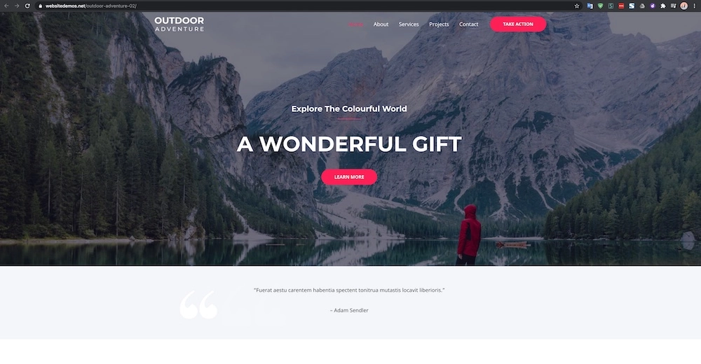
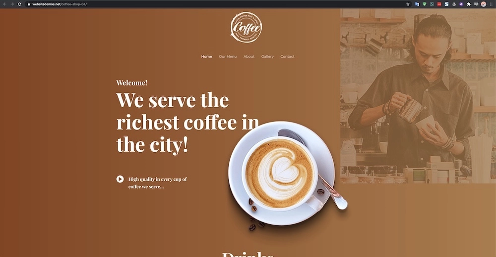
The themes on WordPress may even serve as style suggestions. Note how the content and tone of speech vary depending on a theme user’s supposed business activity area. The overall appearance of some of them may help you in branding your WordPress website.
So, what are these themes exactly?
Theme
WordPress themes are layout templates for sites built on WordPress. Installing them is a quick and efficient way to set the general design.
What kind of impression do you want visitors to get from your brand? How would you like to organize the content? After answering these questions, start with picking a theme. WordPress has a lot to choose from:
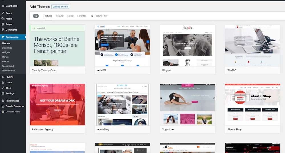
They vary in style, color scheme, in the amount of visual content – choose according to your business segment. If you are a photographer, you need to have lots of pictures on display. They go on the main page, in the portfolio, single shots and galleries of them. An attorney-in-law, on the contrary, would need a whole other setup to look professional. All in all, the design has to reflect clearly what your brand message is.
The themes do not necessarily need any alterations. However, you do not have to stick with the given. If you think that you need some other color or style for your headings, WordPress has Custom CSS for you to configure it.
In case you are afraid that making alterations to your theme may cause failures, try child theme. WordPress allows you to create a copy of your site to implement the desired elements without changing the original one.
When you made up your mind on, so to say, designing the background, it is time to switch to the most memorable branding element – logotype.
Logotype
How do you distinguish brands? The first thing that comes to mind is the logo. Yes, a logo is probably the most memorable thing about a brand. It comprises what’s crucial about the company while being concise to an extreme.
One may argue that this should be your step one since you build the whole design around it. If it works better for you, do it. The order depends on what you already have in mind and how you view it.
If you have not designed a logo yet, good news: there are multiple online tools for this purpose. One of the most popular services is Looka. It asks you to provide the company name and some specificities, offers you some ideas and then creates the logo. Use the results as a new logo or at least as an inspiration.
You have probably noticed that headers (where logos are, by the way) are often located at the top left corner. It is true for WordPress itself, too. Why should the logo be on the left rather than be right-aligned, for instance? Well, if you try to sketch it in your brain, you will need no further clarification. It would feel slightly off, wouldn’t it?
Studies have proven that this is common in most people. Users are more likely to memorize a logo when it is located on the left. This is how our vision works: we scan pages from left to right and from the top to the bottom. So, putting the most important things in the uppermost left corner helps people remember you better.
Not to mention that everyone is used to clicking on the left to go to the homepage. Locating the Home button otherwise can irritate people. It is considered a basic fact in UI/UX, and ignoring it would not work well. Luckily, most WordPress themes are well thought-through in that regard – all for your convenience.
Same as you adjust your page to different screen sizes, make your logo look good in all sorts of settings. Do not forget to create a Favicon – it is a smaller version of your logo that browser tabs display. You may just compress the original icon or make a special one, as long as users can recognize it.
A logo means a lot, but it is not everything. There is much more to the style that has to go hand in hand with your site branding container. It involves such things as:
- Colors,
- Fonts,
- Voice.
Let’s go one at a time.
Color scheme
Obviously, the colors need to match the logo and look generally pleasant. But that is still not enough.
Remember that colors affect people’s perception on an emotional level. If you choose a color palette that is based solely on your tastes and preferences, you may lose attention and even trust.
Some colors are often associated with certain emotions in our brains. It is no coincidence that many social networks have hues in the blue spectrum as the primary color: it brings feelings of security and openness and is known to be the most liked color all over the world. Bright colors remind of fun; they can make you hungry or curious. Try to look for expert opinions backed up by various studies, and you may find a lot of surprising facts. Thus, you will be able to pick the colors that will create the right impression.
And avoid using too many colors: mostly three or four will be just enough. A design too flashy will lower brand recognition. If you really want more colors, play with saturation – thus, you stay within reasonable frames.
Fonts
Open any text document and change the font of any neutral sentence. There is a well-known contrast between some of the fonts like classic Arial or Times New Roman and Comic Sans (the last one has become notorious for its childish look). Try them and a few others: the tone is different, though you have not changed a word, right? Keep it in mind while choosing the right one for your brand. The trendiest fonts are now sans serif – stylish, minimalistic and elegant characters with no ornaments.
Unfortunately, on WordPress, you cannot simply import fonts. You would need to upload them manually and then use the code snippet to tell WordPress where exactly this font goes. The process is not as complicated as it is time-consuming – decide for yourself if you want that particular font that much.
Voice
Here, the term voice describes the tone and style of your textual content. WordPress suggests a lot of solutions for the visual, but it will not write posts for you. This depends entirely on you: stay logical about what you tell people.
The previously mentioned aspects of branding all help you achieve the appropriate tone. However, they are not sufficient on their own if you fail to reflect the tone in your writing. It involves the topics you choose, words and phrases, emotional subtext, cultural background – you name it. Underestimating the effect of any of them may result in terrible misunderstanding. Think of every single word you post.
As obvious as it may seem, your texts and visual content must make a similar impression. Be consistent in your style.
And, more importantly, pay attention to the main characteristics of your target audience. “When in Rome, do as the Romans do”, as the old saying goes; talk to your visitors in a tone that corresponds with the place, time and the idea you are trying to convey. You would probably not try to bombard people with teenage memes if your audience is professors and doctors; neither would you like to be overly serious with schoolchildren. In other words, communicate with your audience clearly and appropriately.
Intuitive design
There is always a specific goal you are striving to achieve. Build your website accordingly: the design is supposed to help users make the right decision and perform the necessary action. Your whole brand book should be explicit enough about what you do, while only implicitly suggesting what you want from users. That is, no straightforward jumping on people begging them to buy/subscribe/etc.
The interface should guide users in the right direction. That means not only building all paths so that they lead to placing an order, making a purchase or signing up for updates. A truly good interface implies that visitors understand where they end up after clicking on any link or button. If everything meets the expectations as much as possible, people feel more confident about their movement through each step.
If surfing a website feels like solving a puzzle or escaping a maze, people will just quit trying. There is a lot of material on UI/UX available for free: it is always a good idea to analyze theoretical background.
Stand out & reach out
A brand’s success is measured not only by how distinctive its image is. Users need to be familiar with it. To achieve this, you have to maintain an active conversation. Cooperate with well-known platforms and create various accounts where people can follow you.
Begin your communication by explaining the fundamentals of who you are.
About us
Many people tend to see this page as practically unnecessary. This is not the best way to think of it. Attaching little importance to telling your story is similar to skipping the introduction when trying to build a friendship.
Without a doubt, you need to tell people about your company. Give a short but comprehensive story to scan through – it will establish more trustful and friendly communication. Write about the key points of your company’s growth and development. Forget about being too bashful: show all your achievements and professional successes. This is like a CV: it gives people the chance to see why they need to choose you.
Most of the WordPress themes have a prebuilt About us tab or button that redirects users to the corresponding page. Note how it often goes right after the Home tab – because it is one of the first things visitors might want to know.
Portfolio
An absolutely crucial part of introducing your brand is building an impressive portfolio. It is the most effective way to display your capabilities. If your portfolio looks appealing, you do, too.
There are also gorgeous templates for arranging your works in many WordPress themes. Layouts vary from media galleries or grids to whole systems of interrelated pages. But, if you do not find any of them suitable, make your own one. You can go for a wholly configurable portfolio showcase you create from scratch; some themes support that.
Contacts
Now, this is about reaching out. It is important because nothing of what we have mentioned before will matter if you do not stay in touch. Regardless of what your business is about, it must be easy and convenient to contact you for any reason.
First of all, create a Contact us page. It also appears in many WordPress themes. Needless to say that all the phones and emails must be working, otherwise what’s the point? And do not forget the live support chat – we talked about the necessity of having it in this post.
The link to contacts often follows the About us button. Repeat the link to your contacts (or type them directly) in the footer together with other essential information – this will make finding contacts even faster.
It is helpful to use call-to-action buttons and notifications. They offer assistance or prompt visitors to perform some action. But again, try not to scare your clients off – avoid being salesy. Do such things in a so-called low-key manner – like an advisory tip.
Now your WordPress site is branded. Make sure you maintain it and work on improvements – and you are all good to go and compete with others online. And we will back you up with our advice and support.
If you need help in branding your site – and business – our design & brand strategy teams are always at your service. Check us on DesignRush among Small Business Branding Agencies and don’t hesitate to drop us a line – we’re happy to help!