Grove Bags
Technologies
UX/UI design
WordPress development
WooCommerce
Gutenberg blocks
Gravity Forms
Client
Grove Bags packaging
Year
2022
About the Client
Since 2016, Grove Bags has been providing the cannabis market with unique packaging technology. The patented TerpLoc ® product line utilizes a blend of several film elements to create the optimal climate inside every package. The main goal of the people at Grove Bags is to provide the most effective packaging in preserving both medicinal and recreational products throughout the entire cultivation to consumption lifecycle.
Location
Ohio, USA
Competence
E-commerce, zero-waste packaging, custom branding
Industry
Offering a wide range of unique cannabis packaging with custom design
Problem
The client’s site needed a complete redesign. Our main task was to rebuild the site content on a new foundation, make it more functional, and refresh the design.
The key problems of the client were:
- Complicated navigation through the sections of the site
- Lack of convenient product search with filtering
- Outdated design
Solution
The Belov Digital team has done a professional job in the field of updating redesigning and rebuilding the existing website and giving a second wind to it.
At the request of the client, we have left unchanged the personal account and Contact Us sections unchanged. Otherwise, our expert developers created the main page and improved the rest of the pages that required modernization.
Main Page
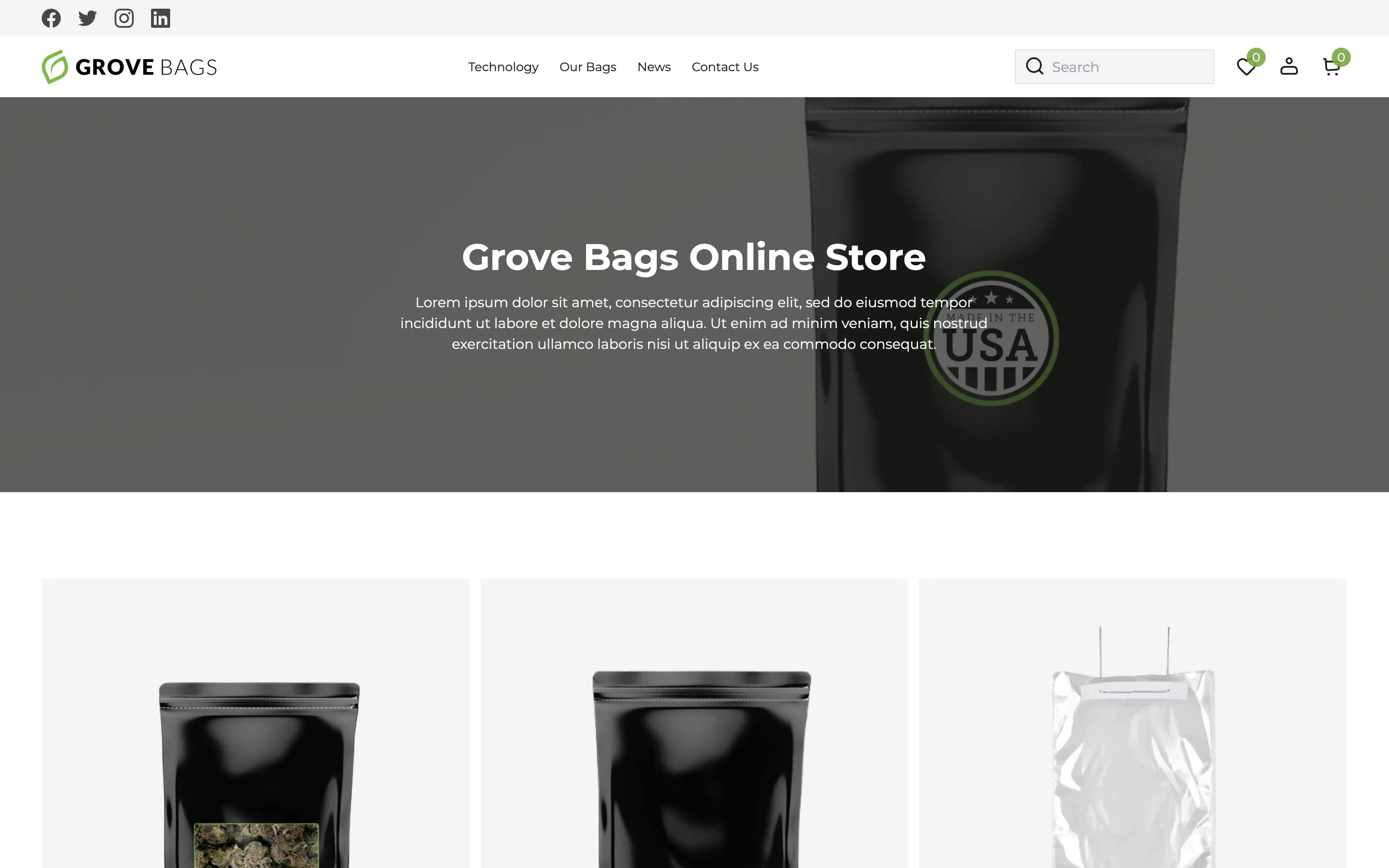
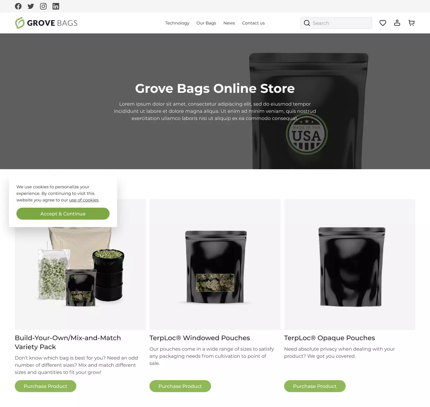
The previous version did not have the main page. After opening the site, the user immediately got to the catalog with the company’s products. We solved this problem by designing the start page using custom Gutenberg blocks. Now, website visitors will find all the information about the company and the product in one place.
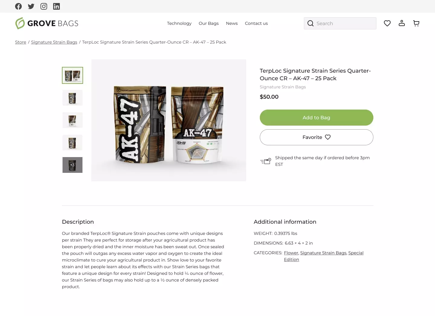
We kept the shopping page as the first one to open, but improved it to give visitors more information about the brand. In addition, we redesigned the product cards to make them handier for customers and to ensure a smoother UX.
Intuitive Interface
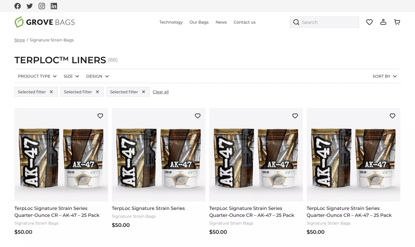
Clear navigation on an e-commerce site matters. That’s why we have paid certain attention to reconstructing the header and the menu in it. Now, the menu looks clearer and helps people easily find the necessary information. All articles about product manufacturing technologies are in the Technology block, all types of packages by subject are distributed in the Our Bags block, industry news, and contact information can be found in the News and Contact Us blocks.
User Experience
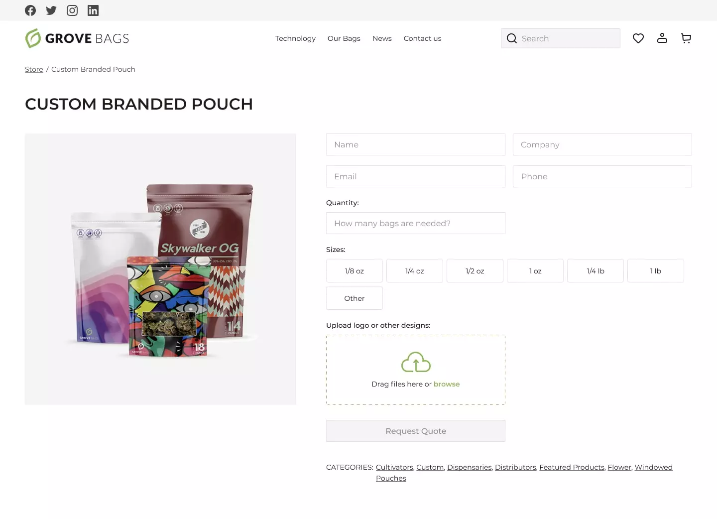
Design-wise, we took everything into our own hands and, as always, decided in favor of the newest trends in the web space. The BDA design team kept the brand’s identity and color palette unchanged, but at the same time updating the visual component of the interface. Illustrations are now structured, and infographics answer all questions even before the user takes time to ask them.
Thanks to interactive elements and animated text of some blocks, the study of the Grove Bags website turns into an exciting journey through the world of cannabis packaging.
Shopping Page
The most important and most complicated part of any e-commerce site remains the product page. We have improved the process of ordering goods on the Grove Bags website. A clear product search page with filtering, informative product cards of all categories (both single and variable), an updated shopping cart, and an order page – all these features will raise the process of customer interaction with Grove Bags to a new level. The integrated Gravity Forms plugin helped us to provide the client with tools to collect data from the target audience of the site.
Login and Registration
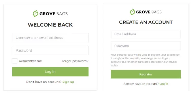
Registration on the online store’s website is the most significant impression. At its core, this is the user’s acquaintance with the organization. We have made this process as concise and convenient as possible. Getting rid of bulky blocks and unnecessary text, and now the process of registering on the site, logging into a personal account, or changing a password has become fast and enjoyable.
Result
Upon completion of the project, our client received a working sales tool, redesigned according to the latest trends in design and functionality.
Our development team has created:
- a homepage based on Gutenberg blocks technology from scratch
- an upgraded product purchase page, starting from a new menu of the entire product line, ending with competently integrated customer reviews of the product
- convenient product search and filtering
- login/registration/password change pages
- several forms with the Gravity Forms plugin
- 404 page
- modern, concise website design
Properly packaged by professionals, the website is will certainly become a powerful marketing and sales tool. In addition, the user-friendly interface will lets users know that the brand cares about their comfort.
More Case Studies
Explore our other projects
KeysForWeb App
Figma2WP
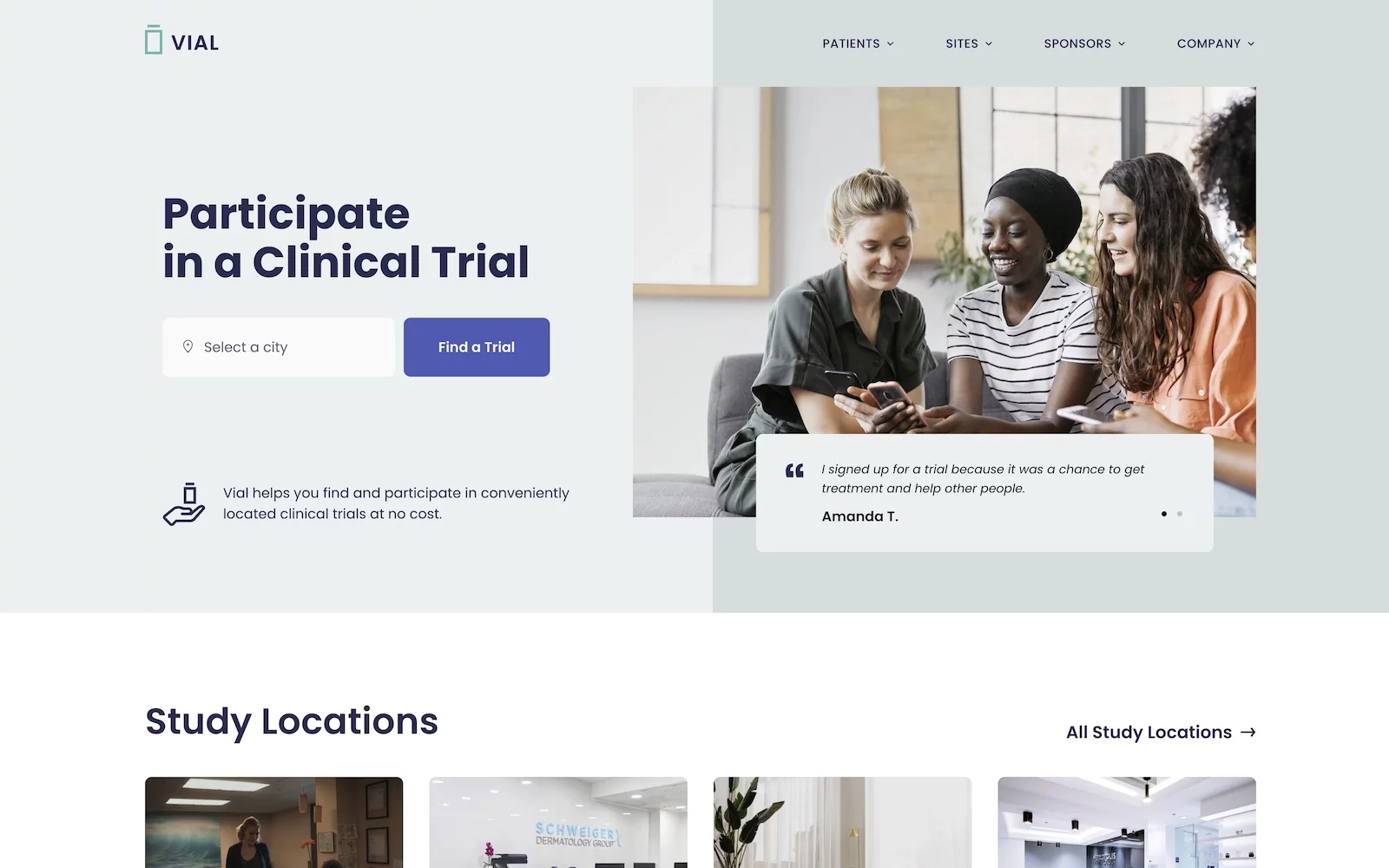
Vial – Revamp & Continuous Partnership

GearUp
Transform Your Vision
Request your website now
Over 900 companies trust us with their online presence
Outstanding. Knowledgable, responsive, supportive and proactive.
Very responsive, fast, worked with me to get everything just right!
Excellent service and experience. This was my first time using Belov Digital Agency and I couldn’t be more pleased. Thank you!!


