
Your favorite WordPress plugin for building forms announced an update, but there are more questions than answers? We’re here to help! Let’s look at the matter more closely.
How can I update now if my WordPress Plugins page doesn’t show the update?
This post will give you the answers to the most common questions about the Gravity Forms version 2.5 release. And here we go!
Gravity Forms for newbies
Since you’re here reading this, most likely, you’re one of the happy Gravity Forms users. If you aren’t, you might want to know what all this fuss is about.
In a few words, Gravity Forms is probably the most popular WordPress plugin for creating forms of all sorts – from a simple contact form to highly complex structures with conditional logic, payment functionality and various integrations.

It’s a premium plugin, but it’s totally worth each cent you pay. Interactivity is an invaluable property of a digital product.
People don’t want to feel excluded when using your site. UX is no monolog of some sort of a robot; it is always a conversation with a user. Let them respond!
Adding even a short form to your website can increase the interactivity significantly. Your visitors will surely appreciate your interest in their feedback; also, you can collect valuable information like emails that’s going to come in handy for reaching out later on. Not to advertise, but to pay due credit: Gravity Forms are great, especially if you don’t feel like coding that kind of functionality manually.
Where’s the update?
So, you might have heard there’s a new version of this plugin that is cooler – no, MUCH cooler than its 2.4… predecessors. But confusion quickly follows the excitement: the WordPress site where you have the plugin installed doesn’t show any update. How come?
The new version release date doesn’t equal the auto-update release date – there can even be a few weeks between the two. That’s the case with Gravity Forms, too. The release took place on April 27. However, your WordPress site may not indicate there’s an update – for this exact reason.
“But it’s already out! So, I want it now!“
We understand your impatience, especially since the new editor interface and functionality seem quite promising. The redesigned form editor is alone a solid reason to install it now, not to mention the rest of the tweaks and updates. Let us show you a bit of a teaser/spoiler:
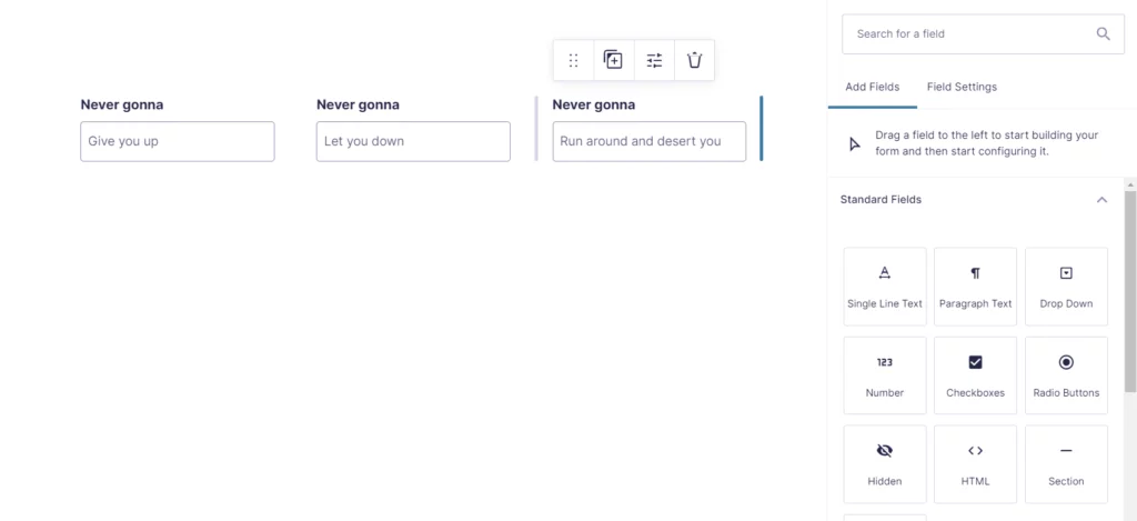
Right, that’s a change similar to the one WordPress editor went through in 2018 – back in the days, it made some news. By the way, if you want to try out the new Forms but don’t have an older version installed, there’s a demo – it shows the change for the better more effectively than any words would describe. What makes it even more awesome is that you don’t need to install the plugin on any website: it works where it is.
But let’s cut to the chase and see how we can update the existing Gravity Forms plugin. So, what do we do?
Manual Gravity Forms update
- Log in to your Gravity Forms account.
- Go to the Downloads area – bear in mind that you must be an owner of an active license for the plugin.
- You’ll find a .zip file there – that’s your new version. Download it.
- Now, check which WordPress version you have and move on accordingly.
For WordPress version 5.5 and higher:
a. Go to Plugins – Add New on your WordPress admin dashboard.
Attention! Do not uninstall the previous version of the plugin!
Keep the older Gravity Forms version you have – you need it so that your data you have in it stays with you. As you made sure the plugin is still there, move on to Step 5.
For WordPress version 5.4 and older:
a. Click Plugins on your WordPress admin dashboard.
b. Find your Gravity Forms plugin and click Deactivate.
c. For the same plugin, click Delete. That will only “clear the room” for the new version field and won’t affect your data. So, confirm the deletion and proceed with uploading (Step 5).
- Select the Upload option and click Browse to look for the file to upload.
- Select the .zip archive you got from the Gravity Forms website (see Step 3) and click Upload.
- Click Install Now. If you’re keeping the old plugin (WordPress version 5.5 and above), select the option to Replace current with uploaded. Otherwise, click Activate.
And you got it done! The 2.5 version is here for you to try.
What’s in the update?
A sneak peek at the beginning of this post surely doesn’t show enough to see if it is worth the struggle of updating. What is the good that the renewed Gravity Forms bring us?
The Gravity Forms team, to give them proper credit, put a lot of effort into testing out the changes they make or plan to make. They offered several candidate versions that people could play with in a sandbox and asked for feedback. This work with the community allowed to polish Candidate 3 – the one that made it to production – you can see the changelog with all the improvements. Let’s see what we have as a result.
Completely redesigned editor
The Form Editor now has a stylish, vamped-up interface that’s more user-friendly and eye-pleasing. It also allows you to see all your edits being implemented live, right as you make them.
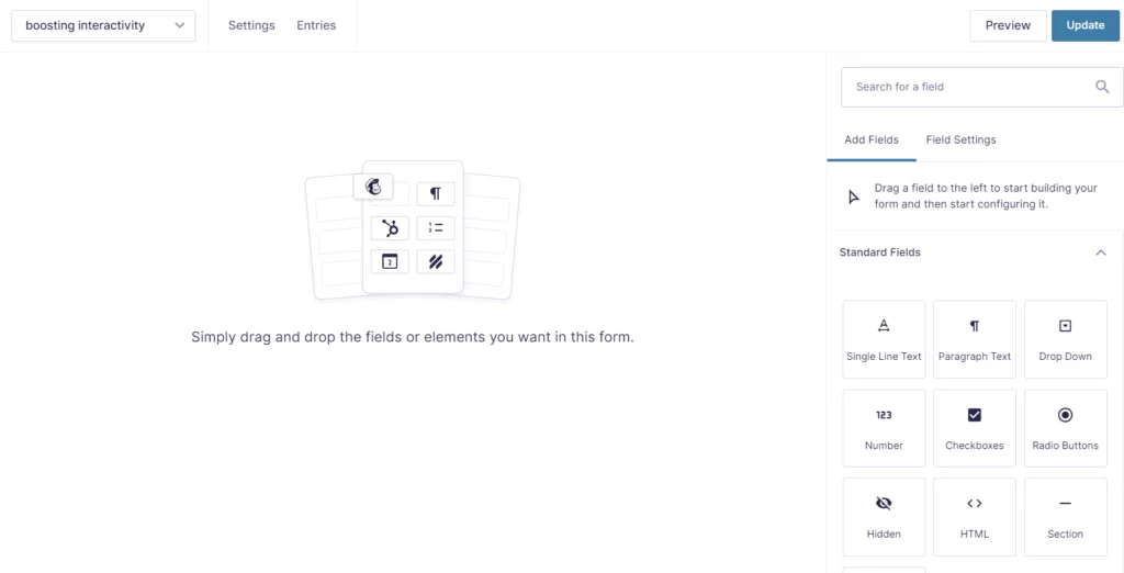
The field types on the sidebar look a lot like the blocks on WordPress. In general, this new interface is made to resemble the WordPress Gutenberg editor, which the Gravity Forms team stated as their goal overtly. The idea is that the plugin should fit well in the WordPress environment and be clear to non-professional users.
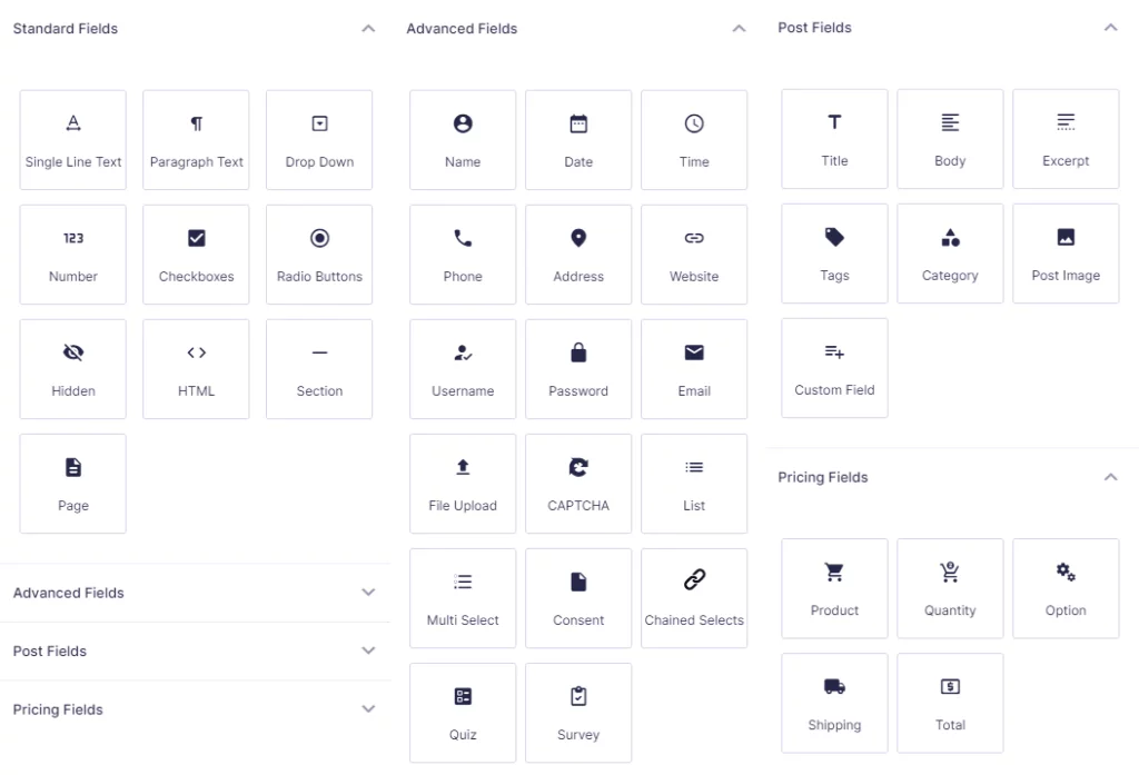
Among other changes, there are multiple different-scale tweaks aimed to improve UX and prettify the interface. The Settings page comes in a revamped look, for one. Also, the Field Settings is now located more conveniently and is more concise due to putting the conditional logic option in a separate flyout menu.
The Form Editor, in general, grew easier to navigate, which is something to be happy about. And that’s true for both the admin side and the end-user side. The latter, for one, won’t see the hidden pages in the page navigation anymore – once again, lees confusion caused.
Drag & drop column control
The convenience of use is additionally amped up by the drag-and-drop column control. Putting fields in a row next to each other is now super easy. All you need is to select a field and drag it to the spot you need.
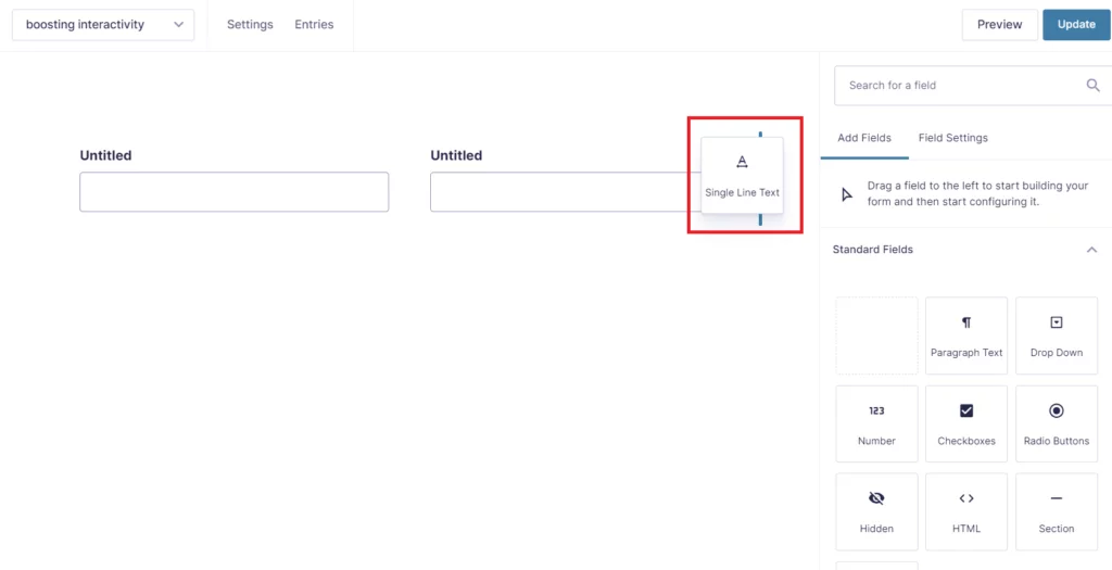
You’re only limited by the number – you can’t squish together more than 4 fields. But that seems like a justifiable restriction: 5 could be too many.
Once you placed the fields in a row, you can adjust the width of every one of them. In the picture above, there’s a handle behind the element being dragged. Handles serve this exact purpose. They appear on hover between the fields: simply drag them to shrink or extend the field – neat and easy.
Another great thing the update brings stems from this drag-and-drop functionality. As the column layout control has changed, you don’t need Ready Classes for them anymore. They are no longer supported because there’s a better substitute, which is the drag-and-drop. Another step in the direction of the ultimate user-friendliness!
Accessibility
This set of changes is what the Gravity Forms team promotes the most. And for a reason: we definitely need to think more of including everyone and making everyone’s experience streamlined.
The plugin now comes with a changed markup that has multiple accessibility improvements. It will be a standard for all the new forms you create. However, the ones you already have will maintain the old markup with the only side note: it doesn’t support column layout.
Legacy markup will still be available. This option is automatically on for all the old forms, but you can disable it in the Form Settings. To do that, find the Form Options section and toggle the corresponding parameter.

Make sure you perform that kind of experiment in a sandbox first. Thus, you’ll spare yourself the trouble of resolving compatibility issues (and a whole range of other problems) on your live site. This is our general recommendation for any changes you apply. The rule of thumb tells to use some kind of a staging environment and create backups before editing pretty much anything on a site.

The new markup (as well as everything in the plugin) is made to fully comply with WCAG 2.1 AA – the latest release of the recommendations on accessibility for web products. Gravity Forms, along with this update, actively broadcast the increased accessibility message. They assure they have done (and will keep doing) everything possible to make using the plugin easy for everyone.
One of the changes in this direction that you can note straight away is in how the hidden buttons are removed from sight. Imagine you create a form where the Submit button is only available once all the fields are filled out.

Previously, the button would simply be removed from the form and would only appear after the conditions are fulfilled. To hide the button and specify the conditions for it, go to the Form Settings and scroll down to the Conditional Logic section.
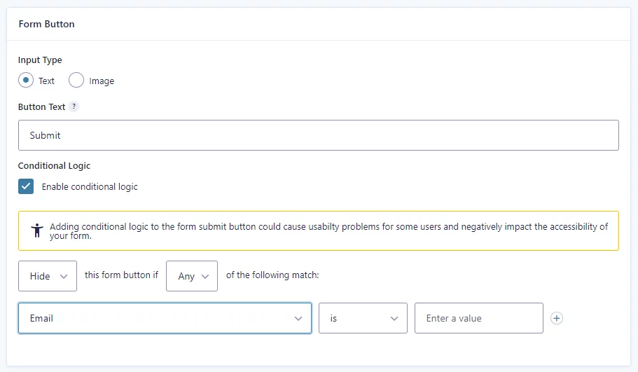
Set all the necessary parameters there and click Save Settings at the bottom of the page.
Note: Form previews don’t always present your forms exactly the way they appear on the site. The plugin will show you a warning about that, but we wanted to make sure it’s not going to be a surprise for you when you apply the changes in a demo.
To help you build a website that’s handy for everyone, Gravity Forms displays a warning message whenever something interferes with accessibility (similar to the note on the screen above). Certain types of fields can confuse screen readers used by people with vision impairments; in case you unintentionally add one where it wasn’t necessary, the plugin will send you this notification:
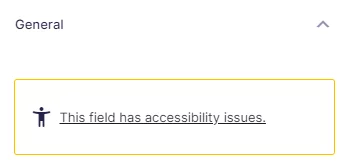
The text is clickable and links you to the page where Gravity Forms expand on what they mean by this message.
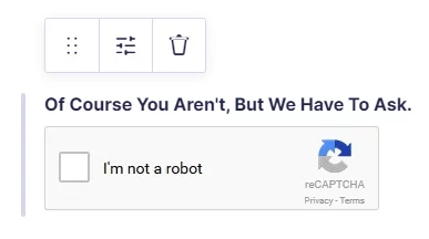
Of course, some of such fields like reCAPTCHA or hidden antispam fields are there for a reason, and them being hard to read by software is their very purpose. You shouldn’t get rid of those regardless of the warnings if they act as filters. But you don’t need to take these notifications as red cards: they only indicate a potential cause of problems, not state that that’s a bad choice.
To assist web people further, Gravity Forms put together accessibility guides for designers and developers. It’s an incredibly helpful reading. While we’re working on a big project, some things may just not cross our minds or can slip from our focus. These articles serve as accessibility checklists – use them and build even better products.
Other improvements
Gravity Forms’ form styles now allow for more customization. One of the changes that allow for that is the two-file system. That is, the forms’ styles are now distributed between two files: basic.css and theme.css.
- basic.css, as the name implies, contains the basic style properties of a form required by its functionality
- theme.css contains what we would call the style of a form: fonts, colors, etc.
“How do I benefit from that?” you may wonder. Well, in short: you can feel more secure tweaking the look of your forms. In other words, this kind of system separates the functionality-related styles (with which you probably wouldn’t want to meddle) from the styles related to form appearance. Therefore, you can apply your form theme settings by disabling the default ones.
To do so, you’ll need to add the following filter to the functions.php of your active theme or the custom functions plugin:
add_filter( 'gform_disable_form_theme_css', '__return_true' );It will disable the theme.css file so that you could apply your styles.
The new version of Gravity Forms has also a set of enhancements in security and optimization. With the new script loading practices, the content should load faster, thus improving the UX of the site with forms.
What’s next?
Team Gravity Forms keeps collecting feedback from users to make the plugin meet and surpass all possible expectations. With the new release being not even one month old, it’s probably too early to talk about the next update. However, they’ve announced at least two things:
- We should expect a package of patches for the mobile display of the form list toolbar and entry list filtering some time soon.
- The next update will make the legacy markup deprecated, leaving only the new one improved accessibility-wise.
So, with the current version, you can feel more confident about the quality of the forms on your website. Want to be completely secure about your site and everything on it? Delegate the maintenance of your site to us! We’ll keep it squeaky clean from any threats and bugs and be there for you to help 24/7. Contact us for a quote or on any other matter regarding your WordPress site – we’ll be glad to help!


