KeysForWeb: Branding & Web Design
Services
Branding
Web design
Gutenberg blocks
PHP
JavaScript
Client
BDA’s in-house project
Year
2021
About The Project
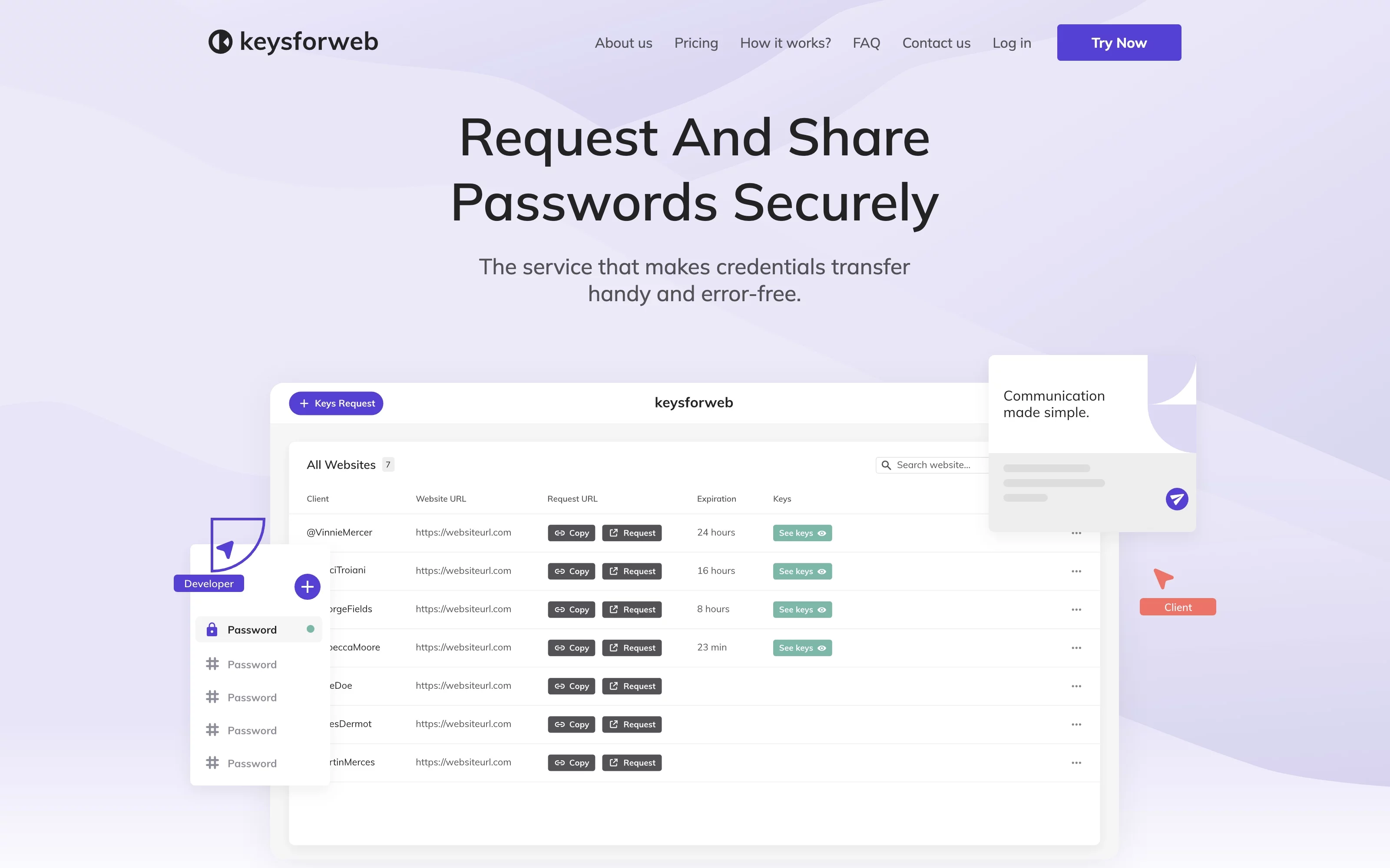
KeysForWeb is Belov Digital Agency’s in-house project – a web app for facilitating sensitive data exchange for digital teams. The service turns the (often bumpy) process of requesting and sending credentials into a streamlined flow for both sides participating in it. At the same time, it maintains security and alerts users about typo-like errors in passwords they send or receive.
Location
International
Competence
Secure password request & transfer with error check
Industry
Secure data transfer
Problem
The task was to create a website for KeysForWeb, our web service for transferring credentials quickly and securely. We needed to build the following pages: Homepage, About Us, How It Works, Pricing, FAQ, Contact Us, and a 404 page.
It involved designing, developing, and populating the pages with content. Plus, the site has to link visitors to the app itself.
Solution
We’ve designed the website in line with the app design to keep the service-related content similar in the users’ eyes. The website doesn’t overload the visitors with content and information and keeps the user flow simple and intuitive.
The website provides all the information about the service and how to use the app. The subscription plans presented on the Pricing page are directly related to the cart so that users can select and buy a plan in a click.
Visual identity & Brand strategy
The brand concept implied that branded media will mostly be digital: the app, its website, advertising, social media, etc. The name reflects that the app is specifically designed to work with access keys for web services and ensure search appearance in the early stage of the startup growth.
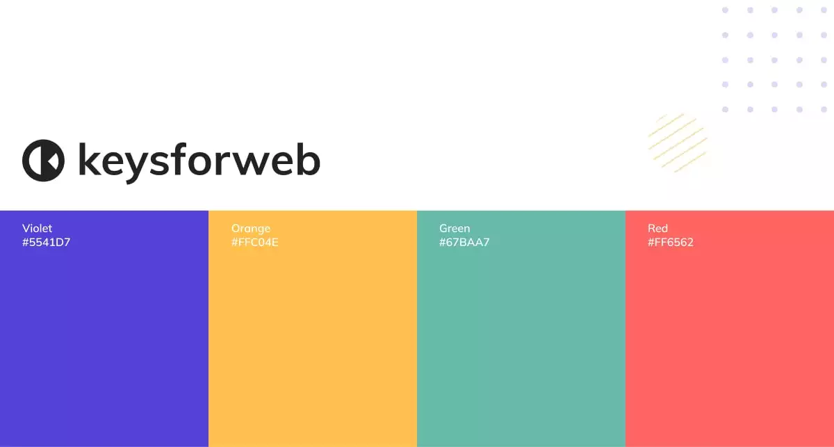
To highlight security and convenience as key features, we used purplish blue on the light background as the main color: it correlates well with the industry standard and the values promoted by the app. Other colors from the color code were soft so as not to irritate users or make them uneasy.
The logo is adapted for the web and social media – its circle shape fits well into the circle-shaped social media profile picture templates.
Design
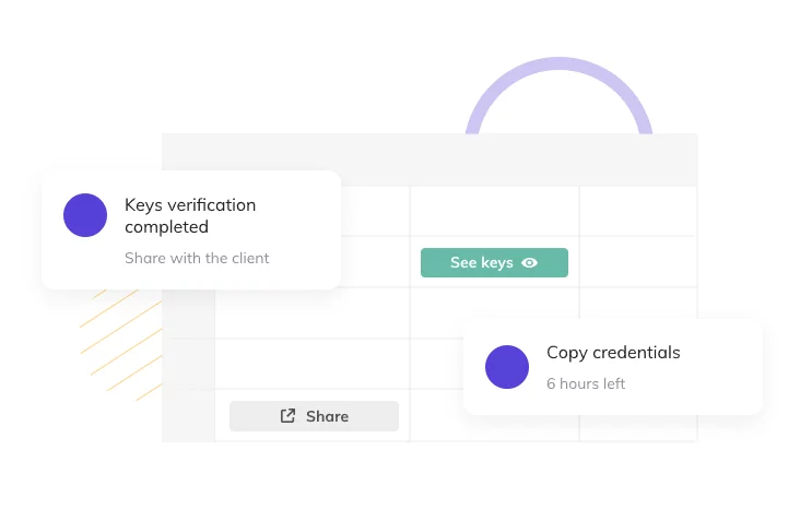
For the website, same as for the app, we’ve decided in favor of flat design, minimalistic graphics, and a calm color scheme. There are very few bright accents to assist attention focus.
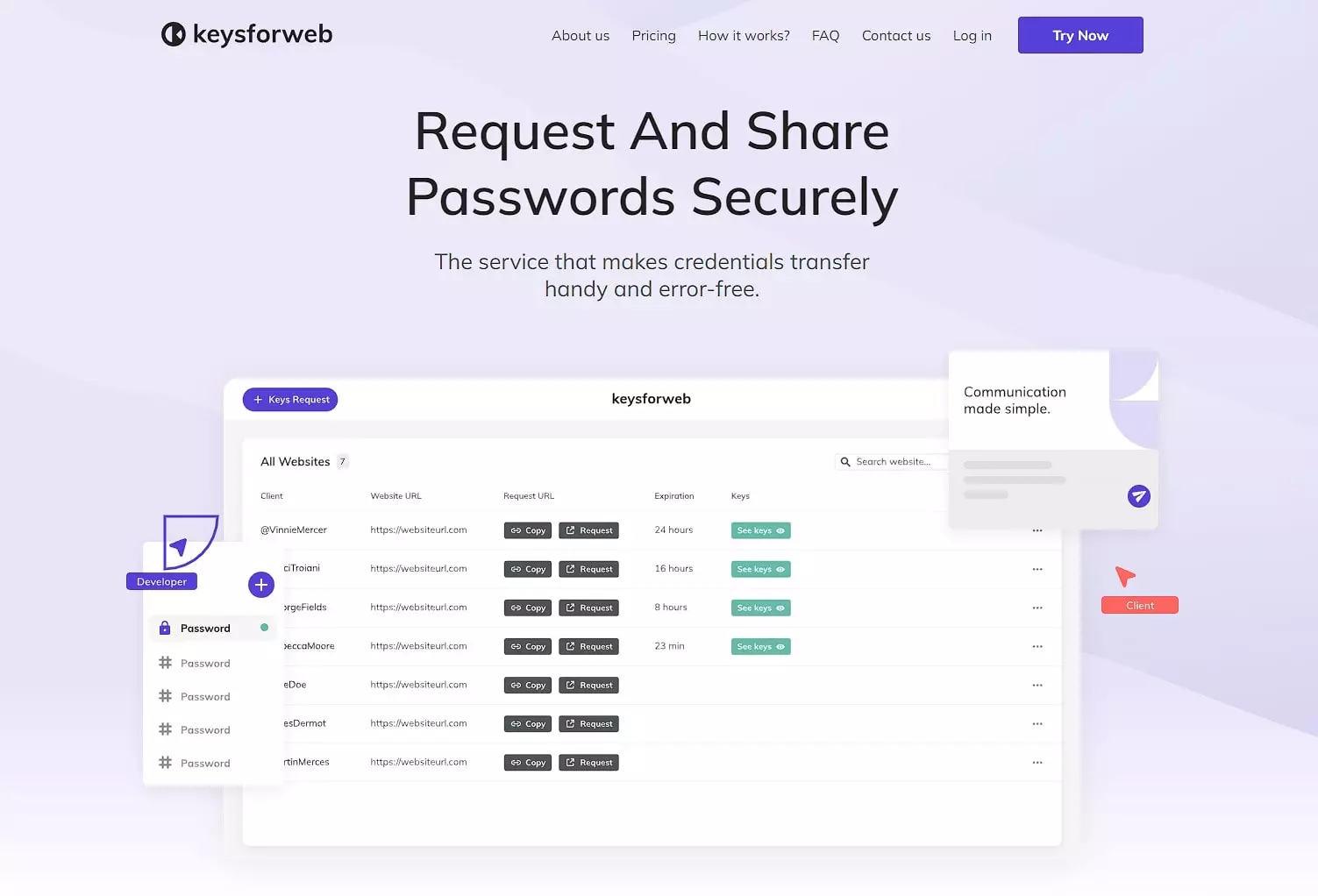
Homepage
The homepage has several custom Gutenberg blocks and forms. The Don’t Miss Any Update form allows users to subscribe to the app’s news and find out about the upcoming updates. It also appears on other pages of the website. All the content, including button text and links, is editable from the admin dashboard.
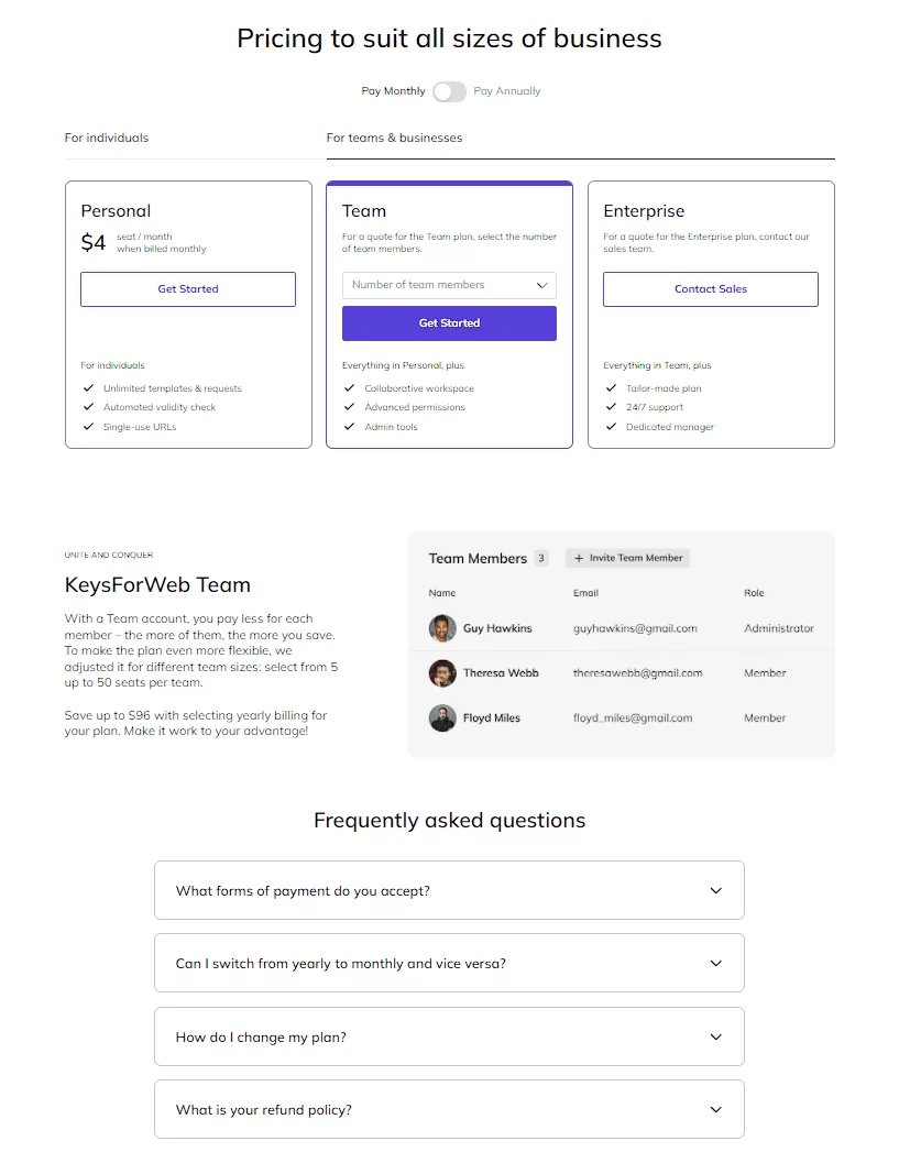
Pricing page
On this page, users can find all the information about the subscription plans the app provides. Each plan is a WooCommerce product, and the Get Started button leads users directly to the cart with the selected plan. There, they can proceed to checkout and payment.
This page also has its own FAQ section to prevent any confusion that may arise in users. The questions are arranged in an accordion menu.
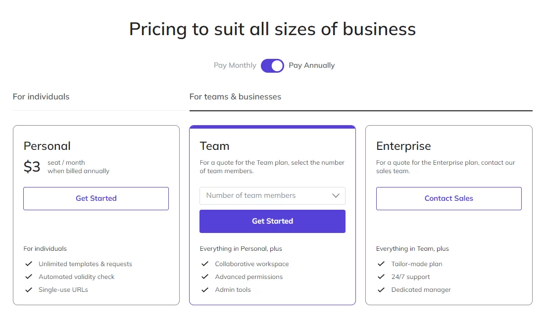
Subscription Plans block
KeysForWeb offers a variety of plans for single users and teams. The prices in the blocks are dynamic: they change depending on the state of the toggle above. Users can select monthly or annual payment types and instantly see the corresponding price for their selected plan.
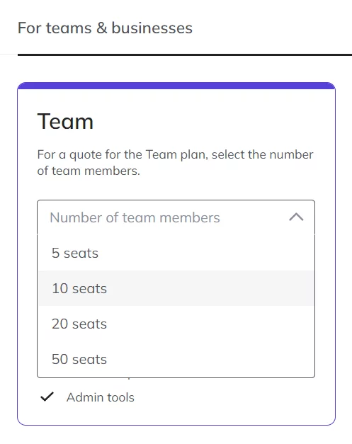
Team Plan block
Since there are several options for a team subscription, the price in this block depends not only on the toggle but also on the number of team members selected. The dropdown menu above the Get Started button provides all the options and activates the button only after the user selects the preferred number of seats per team.

Connection to the app
The app resides on a subdomain of the site (app.keysforweb.com). To switch to the app, users can click the Login button in the header. It redirects them to the login page where they can also sign up if they’re not registered yet.
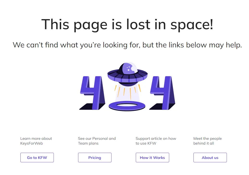
404 page
The 404 page appears when a user somehow ended up on a non-existing address on our domain. To help users find their way to what they need, we didn’t just explain the page doesn’t exist. Additionally, we provided links to the actual website pages and supplemented them with descriptions so that users know where to go.
Result
The KeysForWeb website helps users get acquainted with the app and its functions. It ensures that people can easily find useful information, subscribe to the app or to the newsletter, and learn more about the service.
The Pricing page is highly dynamic and helps users select a plan to suit their needs. The prices adjust depending on the state of the toggle and on the option selected. The Enterprise plan prompts users to contact the sales to discuss a custom deal for their number of users and other conditions.
The user flow on the site is clear and streamlined to keep everything perfectly understandable and to help users register in or log into the app located on the subdomain.
More Case Studies
Explore our other projects
Civics Alliance
European Bank for Reconstruction and Development ‘20
MetaGeeks
European Bank for Reconstruction and Development ’19
Transform Your Vision
Request your website now
Over 900 companies trust us with their online presence
All members of the team communicated quickly and clearly. They were great to work with and completed my project quickly. I will hire them again when needed.
Belov Digital is super fast and does a great job helping us!
Belov Agency has been great again. Another successful year.


